Project
This app was for my Google UX Designer Certification course. The project was designing for the social good.
My Role
I was the UX Designer and Graphic Designer.
Project Goals
Challenge: Construct a resource for the victims and families of crime to diseminate information to the public.
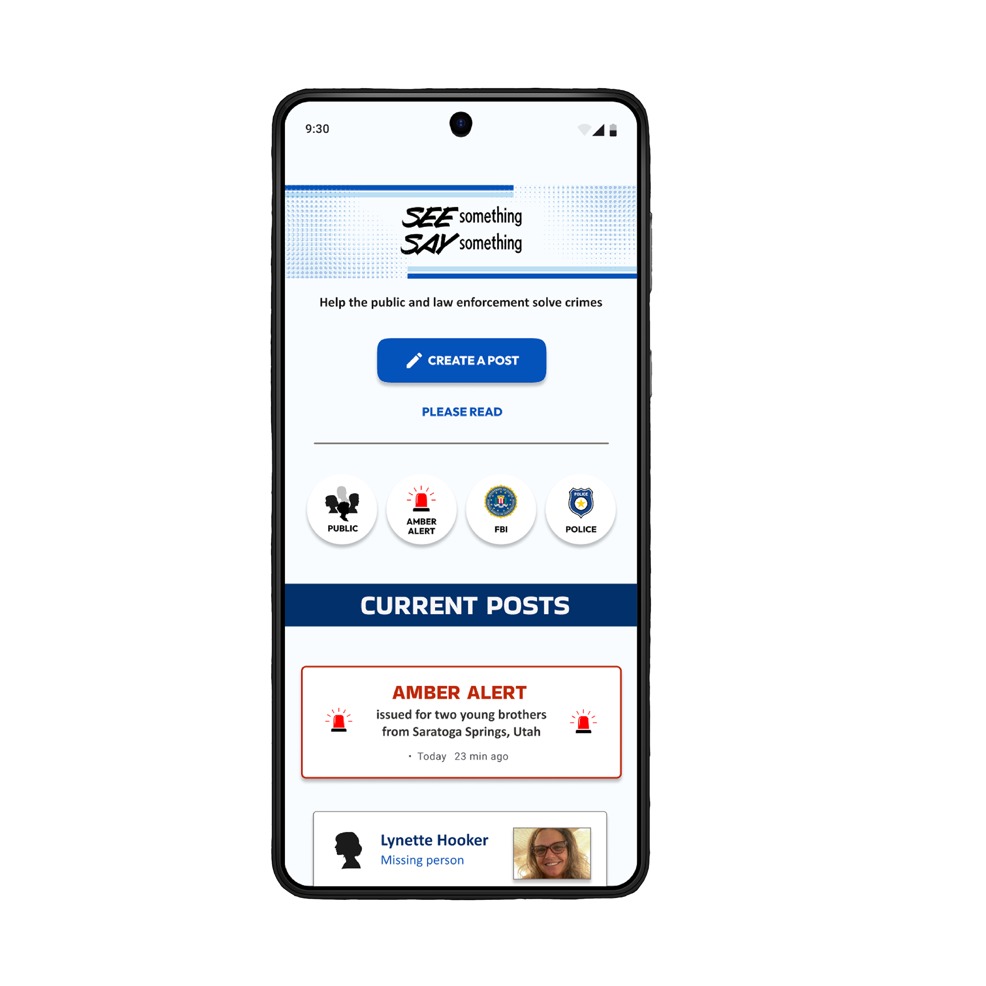
Solution: Create a mobile app which will allow the families and friends of victims to post to the public information about crimes.
The Research
The research included viewing true crime through documentaries. I also read reddit posts about the ethics of the true crime drama and posited several questions to Gemini about societal attitudes towards true crime.
In the user studies that followed, I asked specific questions of the participants dealing with their attitudes towards true crime and their interest in the genre.
Primary research came through true crime YouTubers and LawTubers, including, but not limited to the following: Grizzly True Crime, Truth Revealed, The Lawyer You Know, Drop Dead Serious, Rotten Mango, I Don't Belong Here, Loophole Lawyer, and Brother Counsel.
I also constructed a competitive audit report, surveying common true crime apps.
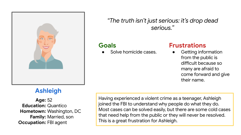
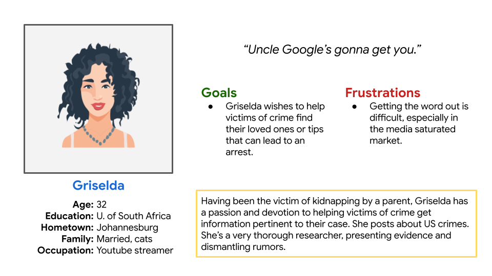
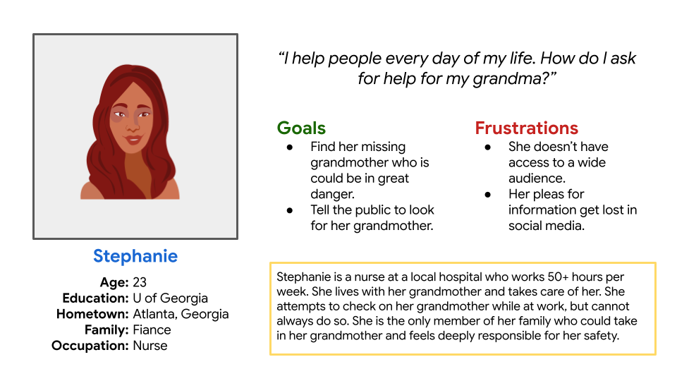
The Users
Lower to upper class
All ages
USA residents
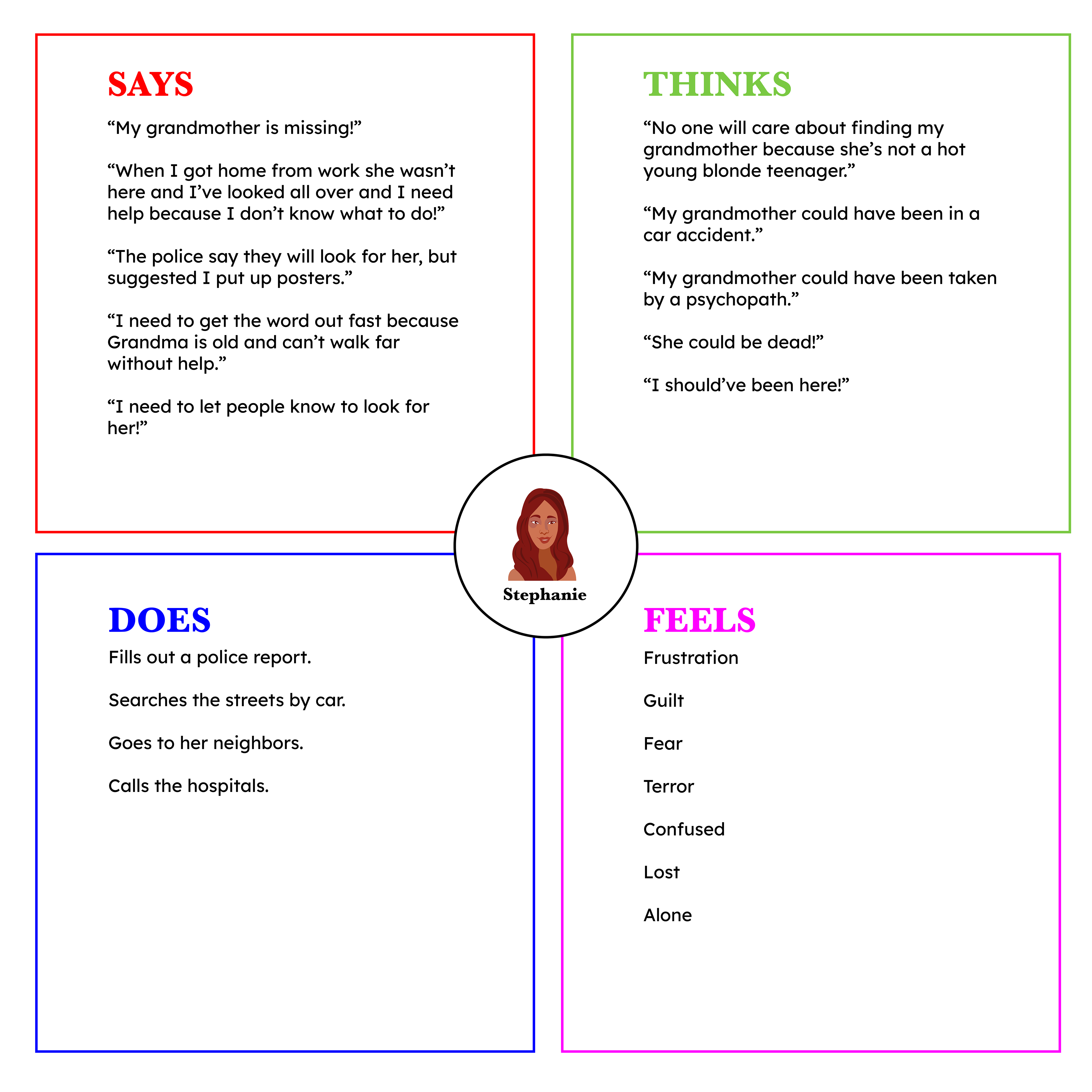
Note: Users who are the victims or the families of victims of a crime. They will be in a highly emotional state and will require an app that is as direct and simple as possible.
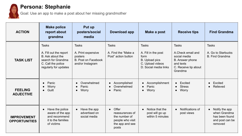
Design Architecture
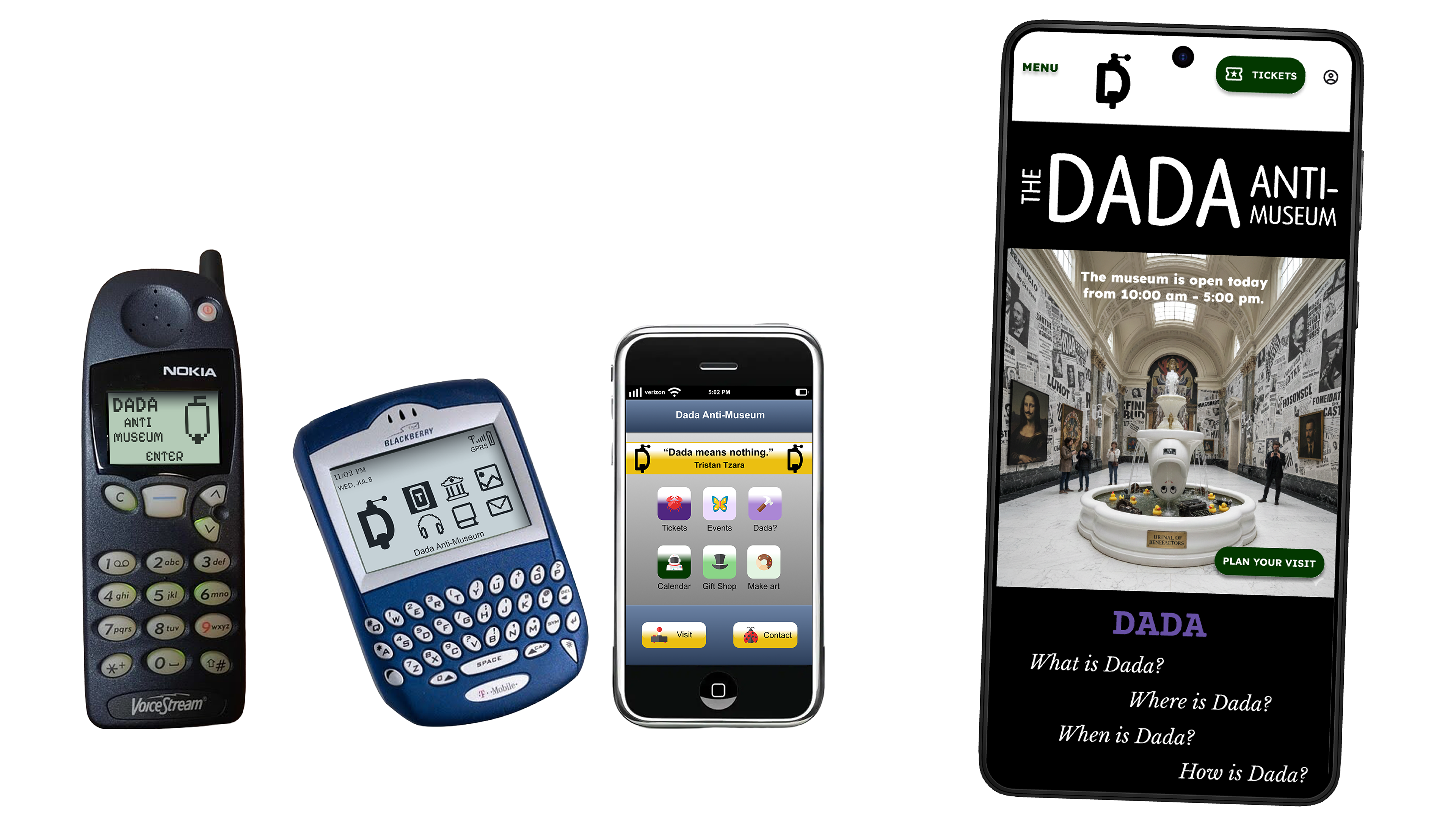
My previous projects for this course, The Dada Anti-Museum App and Website, during my building processes. For this project, I had the specific goal to make the See Something Say Something app as focused and simple as possible.
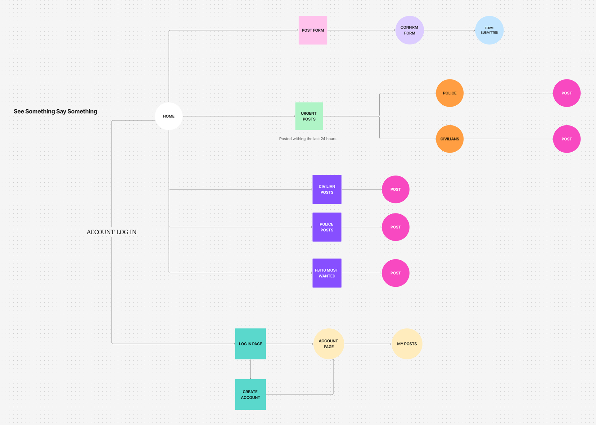
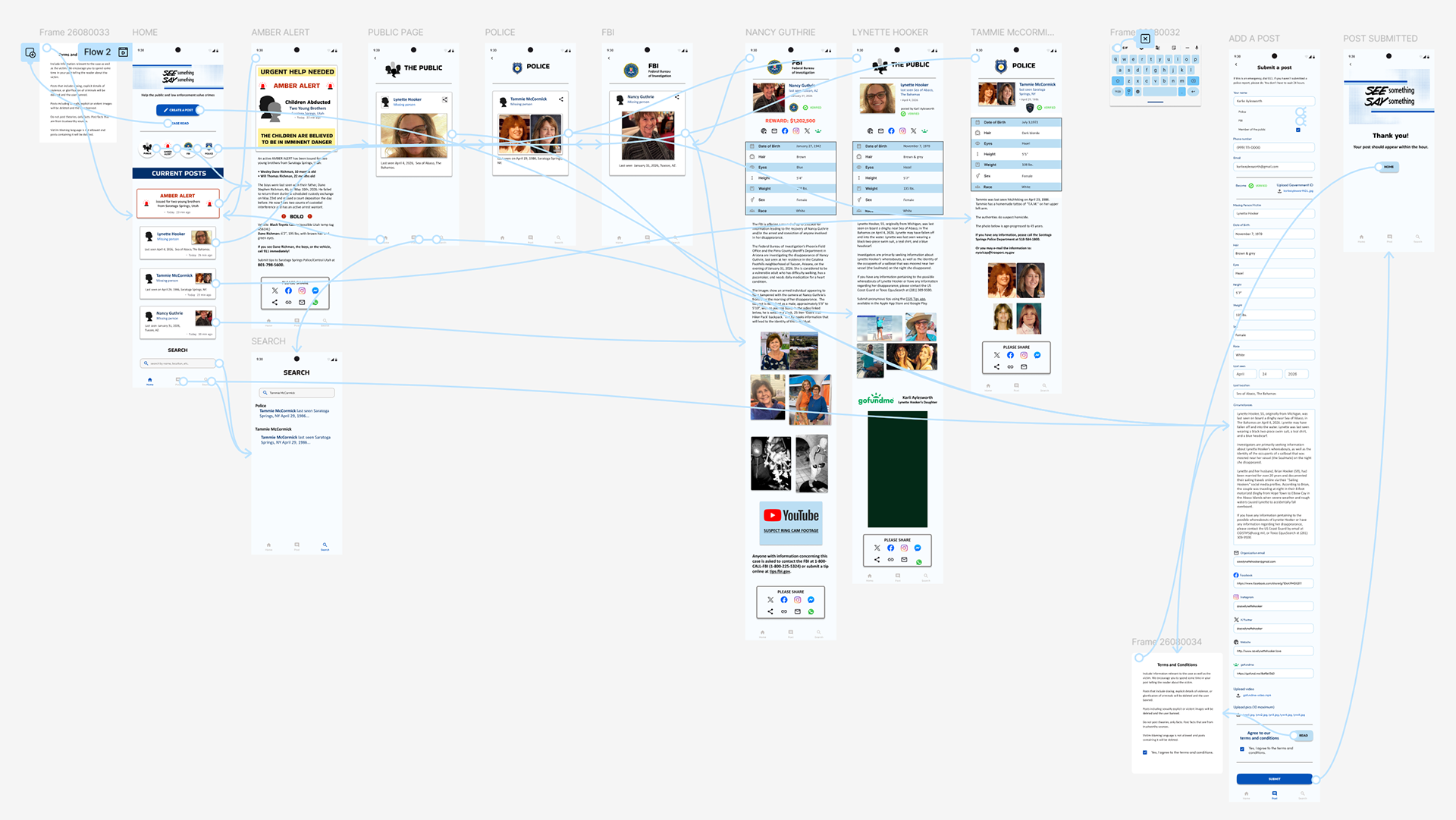
The structure for the app is hub and spoke.
User Flow Diagram
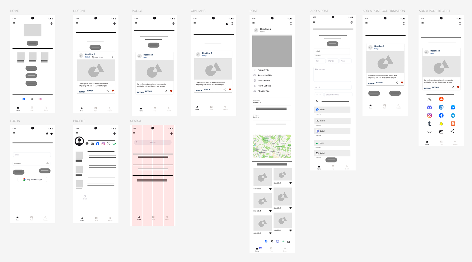
Wireframes
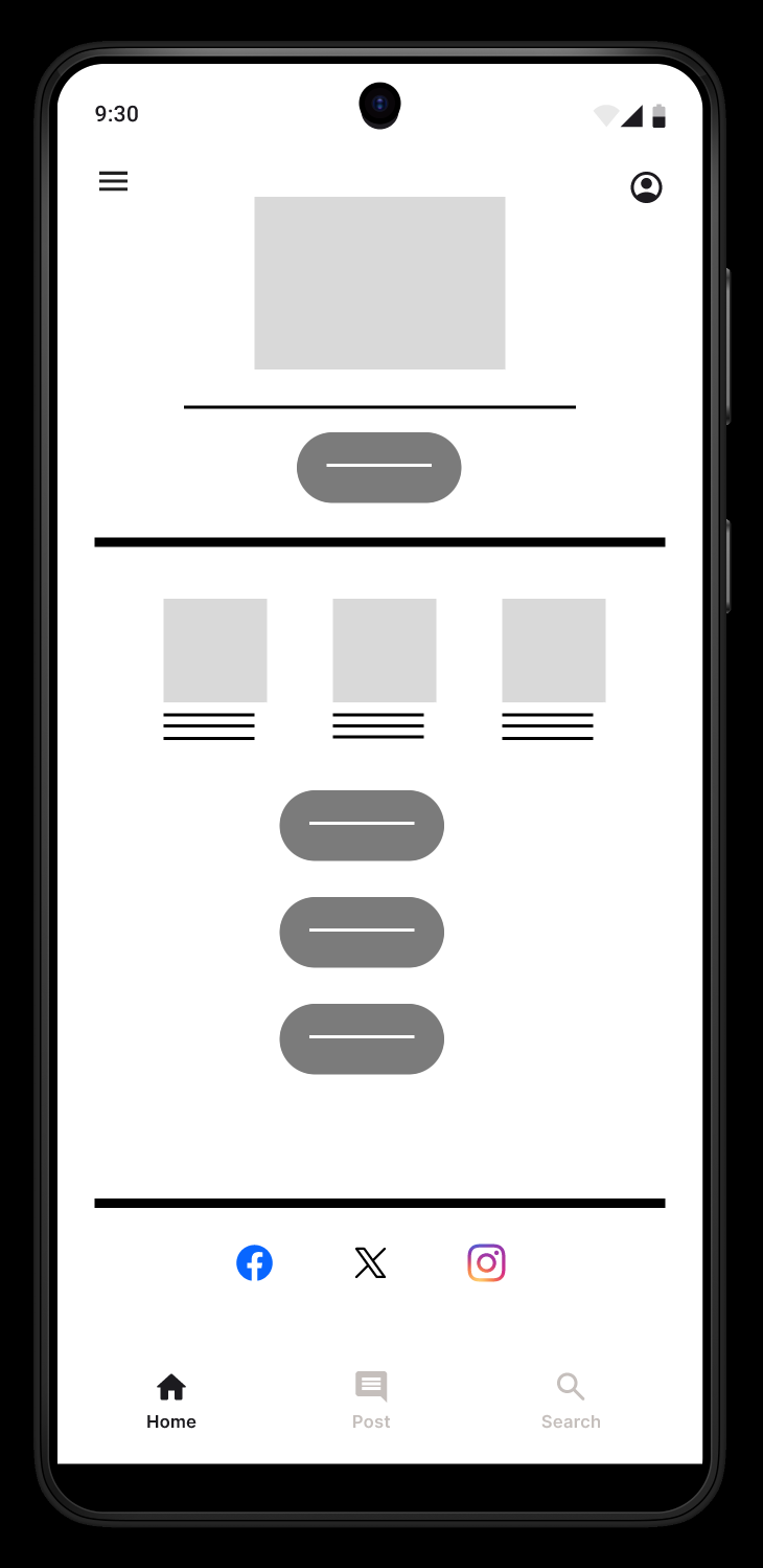
Home screen.
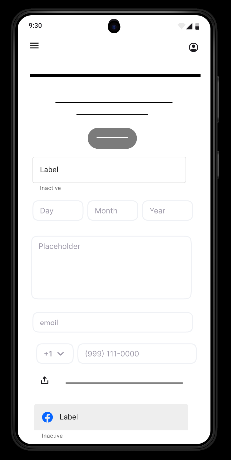
Post form.
Lo-Fi Prototype
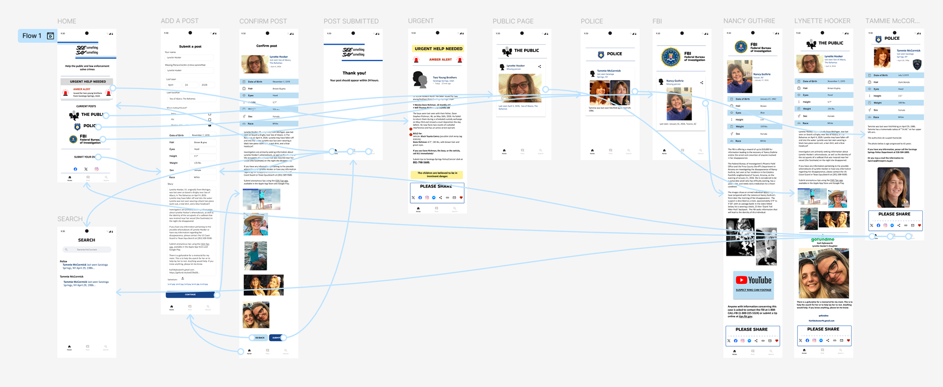
One element I omitted from the wireframes was the ability to create a profile. I didn't think this was especially necessary, as other true crime apps didn't have user profiles. I also removed the element in the spirit of keeping the app as streamlined as possible.
User Research Study
There were three major questions I wanted to investigate for this app. One, is the app efficient, with intuitive navigation. Two, does this app exploit the victims of true crime, or, will users feel this app is exploitative. And three, will users believe the posts from the public are factually true.
I conducted two unmoderated usability studies through Google Forms, finding participants through Instagram and reddit.
The results were surprising. All users, in both studies, found the app easy and intuitive to navigate. In the first study, users believed the app exploited the victims and families of true crime. In the second study, I asked more pointed questions about the app and its ethics, and users didn't believe the app was exploitative.
In both studies, the users felt the posts were factually true, but believed posts by law enforcement were more accurate and detailed. For the hi-fi prototype, I added a feature for users to verify their identity on posts to add an element of trustworthiness.
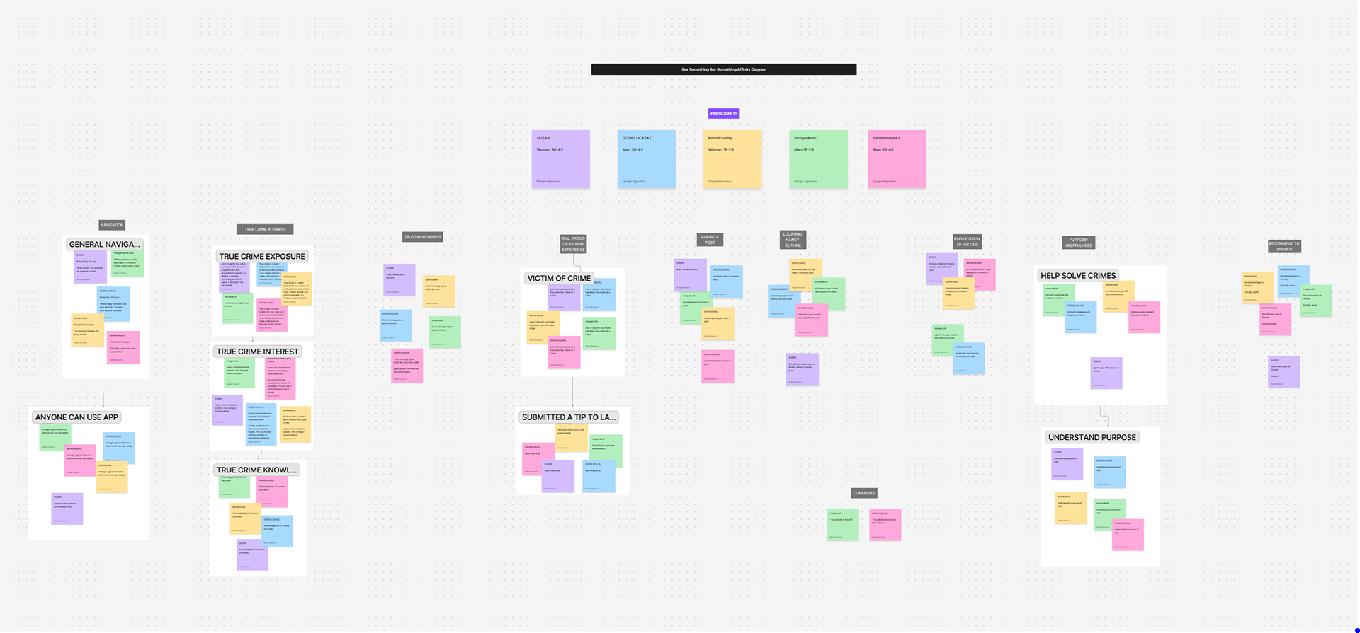
Affinity diagram
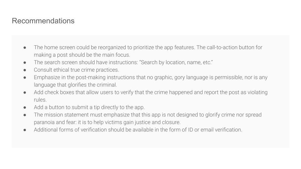
Hi-Fi Prototype
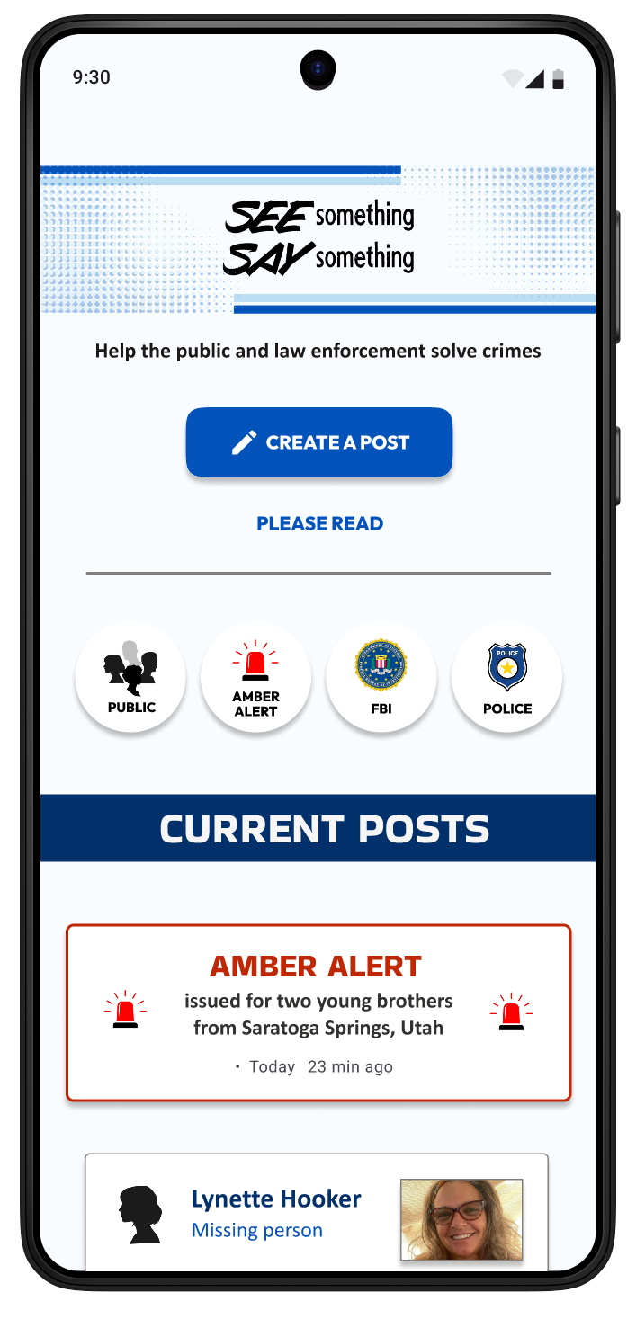
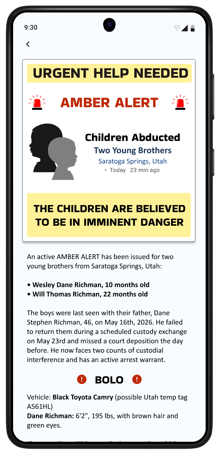
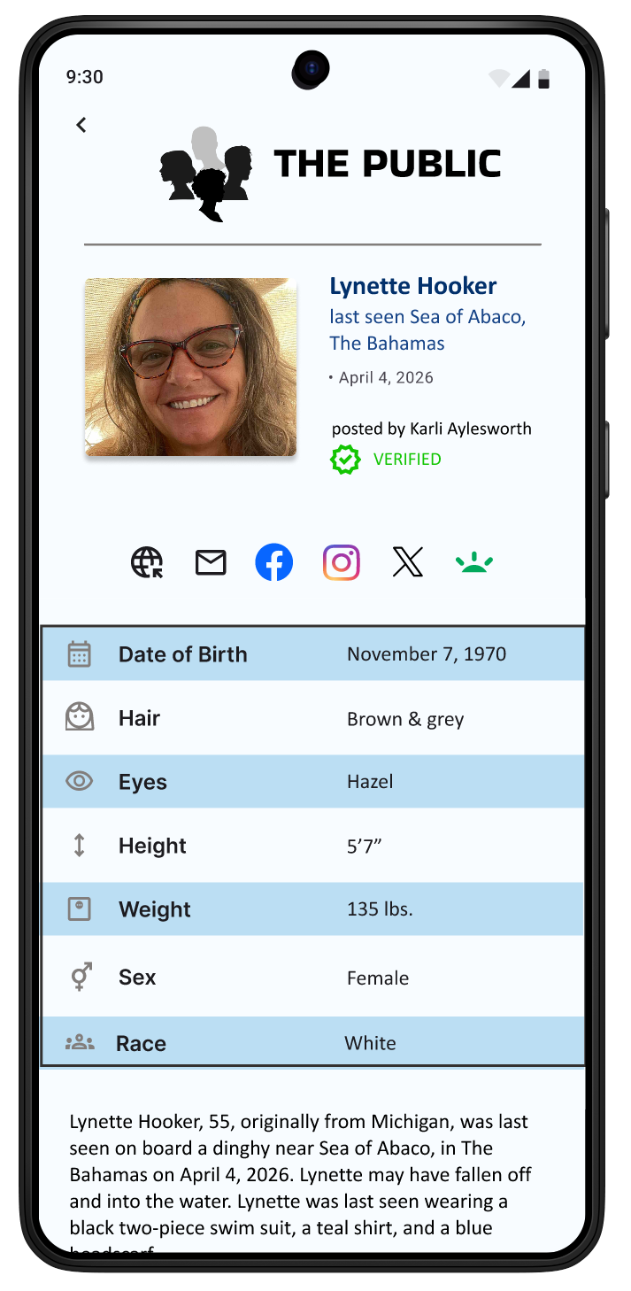
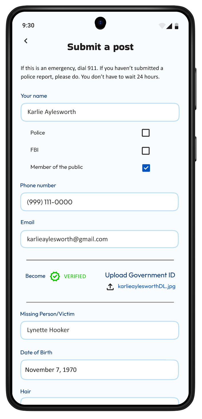
Navigate the App:
Accessibility Considerations
1. I created uniformity in the design, establishing common text patterns, colors, icons, and arrangements. I adhered to app format conventions.
2. I primarily used the font family Lexend. Lexend is the most readable font for anyone with reading challenges, especially neurodivergent people.
3. I used different patterns to associate each section of the app. This would make groupings easier to see for the colorblind. The color palette is also high contrast.
What I Learned
1. This project felt manageable for a UX design student. I didn't scope creeped myself.
2. I feel very strongly about the victims and families of true crime. I feel I've created an app that could prove a valuable resource.
3. I finally managed to organize the app in Figma. I created separate files for each stage. I didn't allow myself to conflate the wireframes with the lo-fi prototype. But, I still have issues with organization.
4. I have the following biases: Creator's Bias, Habituation Effect, Selective Abstraction, False Consensus Effect, Self-Reference Criterion, and Selective Omission.
5. I feel uncomfortable with white space, and feel it is a bad design choice. This isn't a bias, but more of a side-effect of my neurodiversity. In this project, I worked to explore elements of white space, but it was still a struggle.