Project
I designed the website for my Google UX Designer Certification course.
Goals
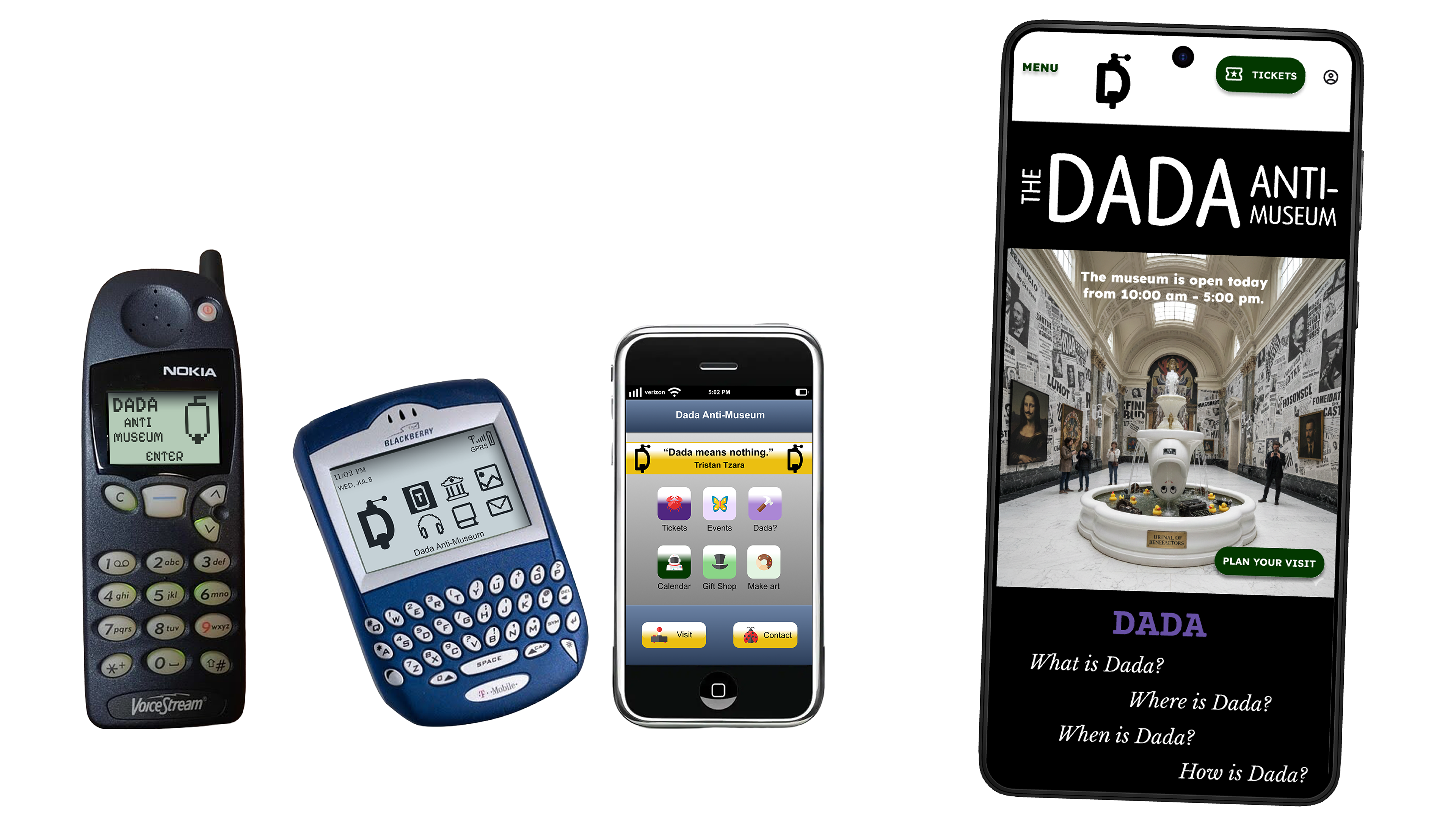
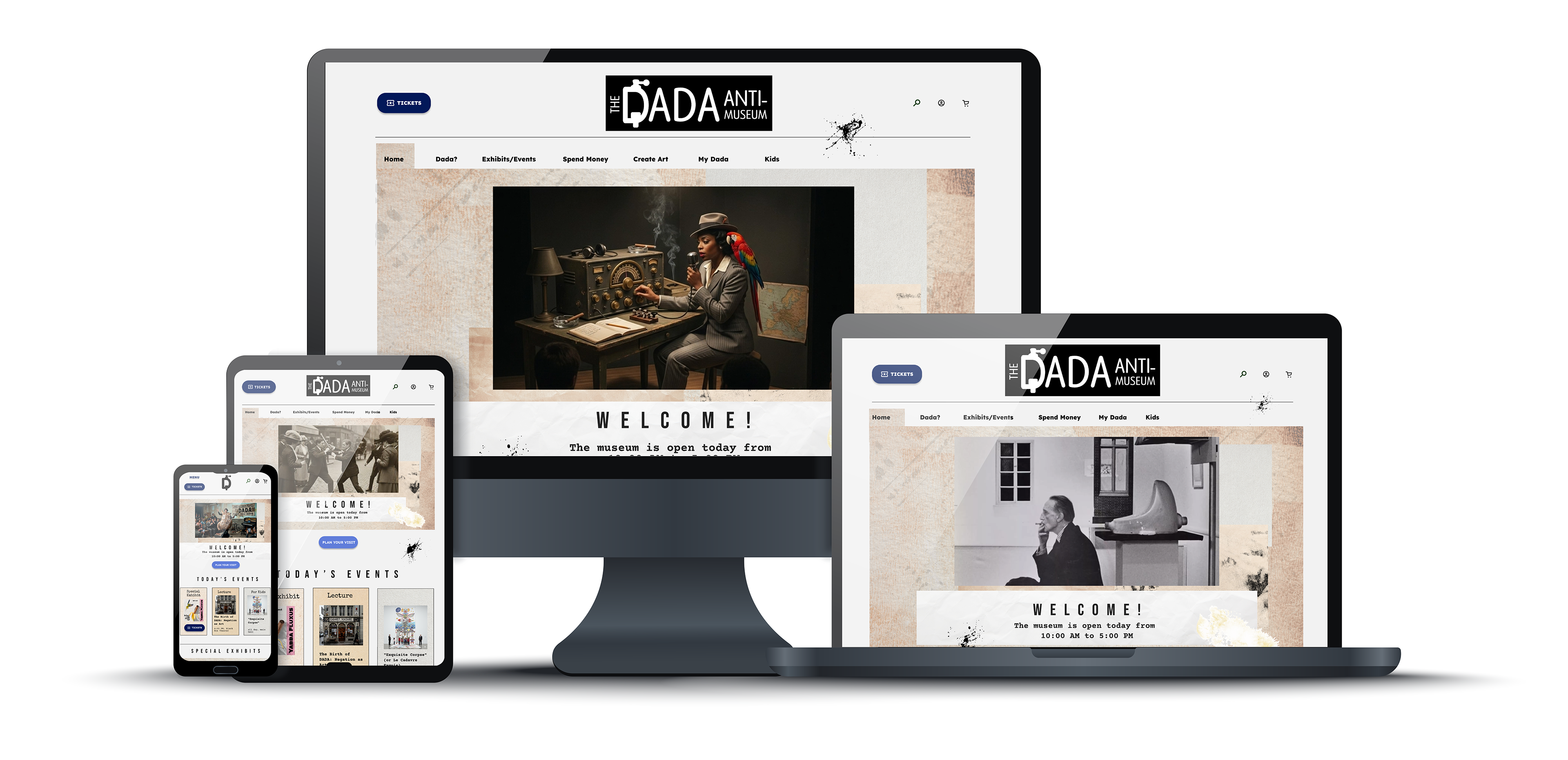
My goal was to take the Dada Anti-Museum app and translate it into a website, including its responsive designs.
Challenges
CHALLENGE: My biggest challenge was organizing the large amount of information the Dada Anti-Museum would possess. The website is designed to pick up where the app left off. It would provide more in-depth information about Dada historically and artistically.
BIGGER CHALLENGE: My initial ideas were to add Fountain, a reddit-like conversation structure which would create a society of Dada artists and aficionados. This also encourages the spread of Dada throughout the world through conversation and sharing. This would help expand the universe of the museum. The museum isn't only for those who can physically visit it. The world can virtually visit it.
CONSTRAINT: I need to avoid scope creeping. While constructing the app it ballooned and became unwieldly. Expansion is good, but not beyond what my beginning capabilities are.
My Role
I was the UX Designer and Graphic Designer.
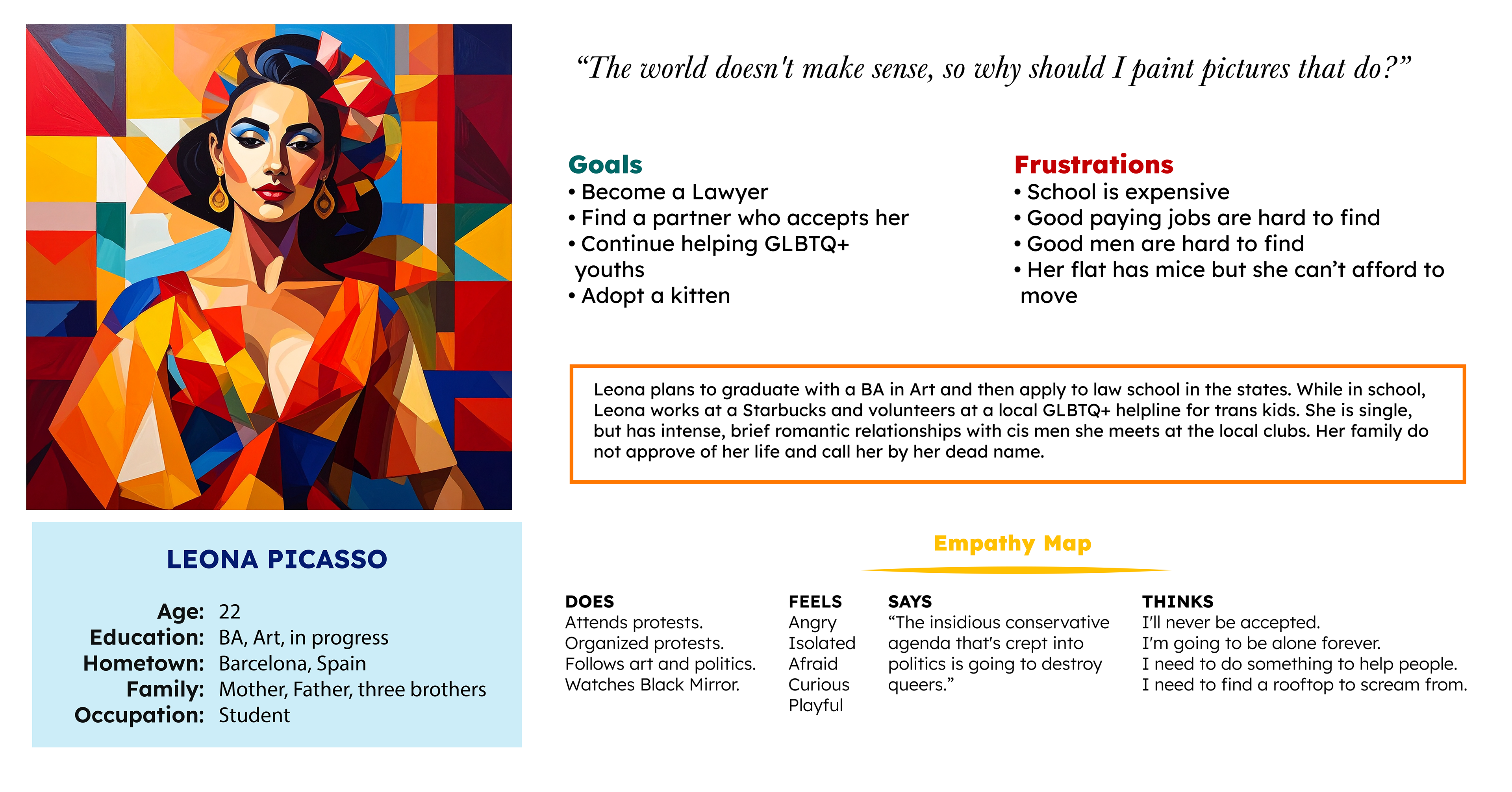
The Target Audience
Married/single/divorced
lower to middle class income
college educated
professionals/students
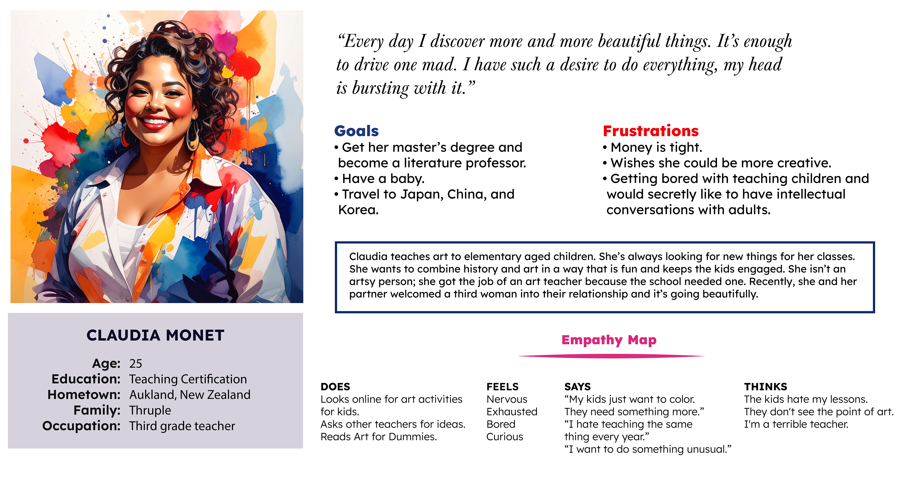
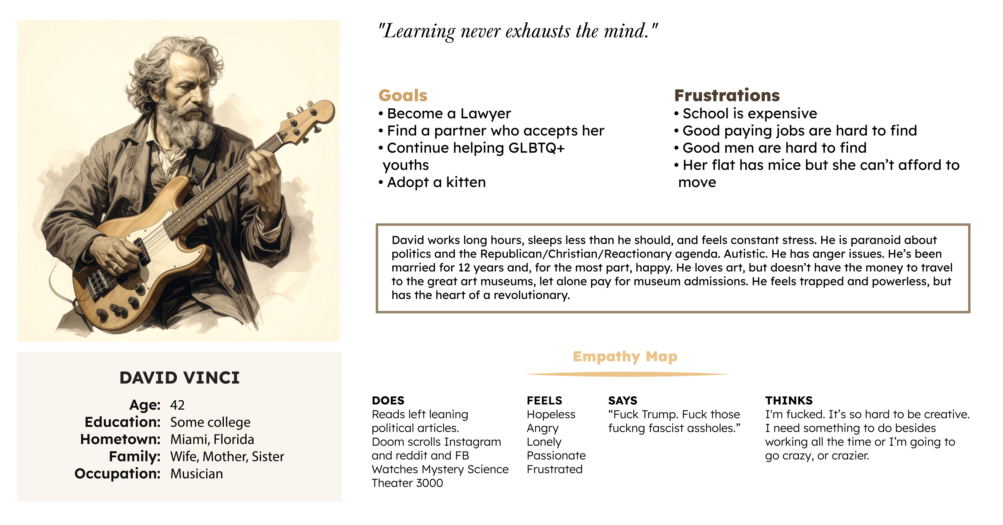
Research Conducted
CHALLENGES: Working on my own, finding potential users to interview proved difficult. I asked several friends who fit the demographics about art in general, Dada, and museums.
RESEARCH CONDUCTED: I opened a Dada Anti-Museum Instagram account. Presenting as a museum, posting three posts, and not soliciting followers, the account organically received 17 followers. I extensively researched Dada, it's history, philosophy, and major artists. I revisited the competitive audit report conducted for the app and further investigated the museum websites.
RESULTS: Dada will attract online attention. It's "nonsense" philosophy will attract curious users.
Initial Concepts and Design Strategy
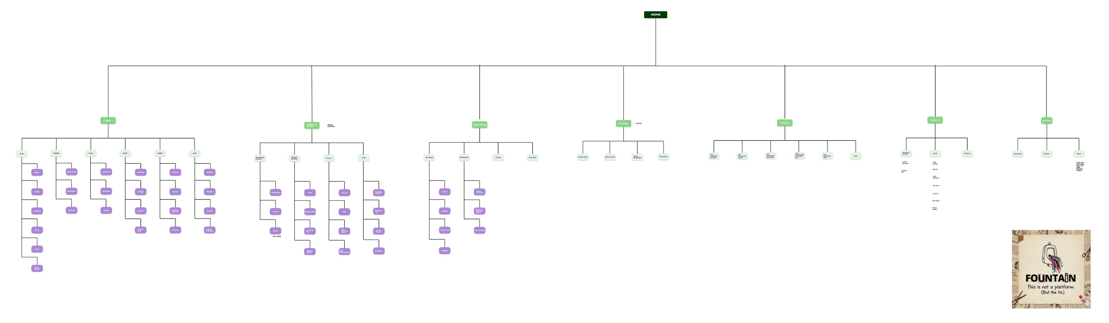
INFORMATION ARCHITECTURE: Considering the massive amount of information the website would contain, a hierarchical tree was the logical choice. The challenge was organizing the information into seven categories. This was a challenge I struggled with throughout the process.
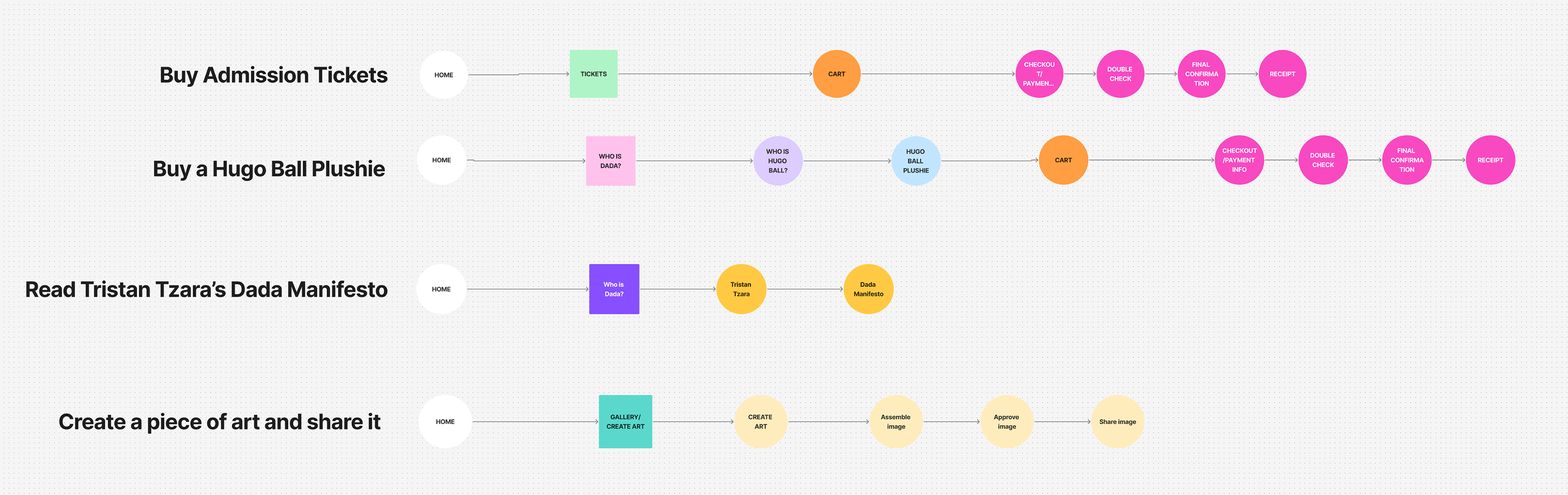
USER PATHS: I mapped four paths that would represent the main paths users would follow. Buying a Hugo Ball plushie would follow, relatively speaking, the same as buying a Ploop Avant bobble head. Although these paths could easily be accomplished via the gift shop links, I wanted to create alternative paths through the site. This would reveal the number of ways users could end up in the same place.
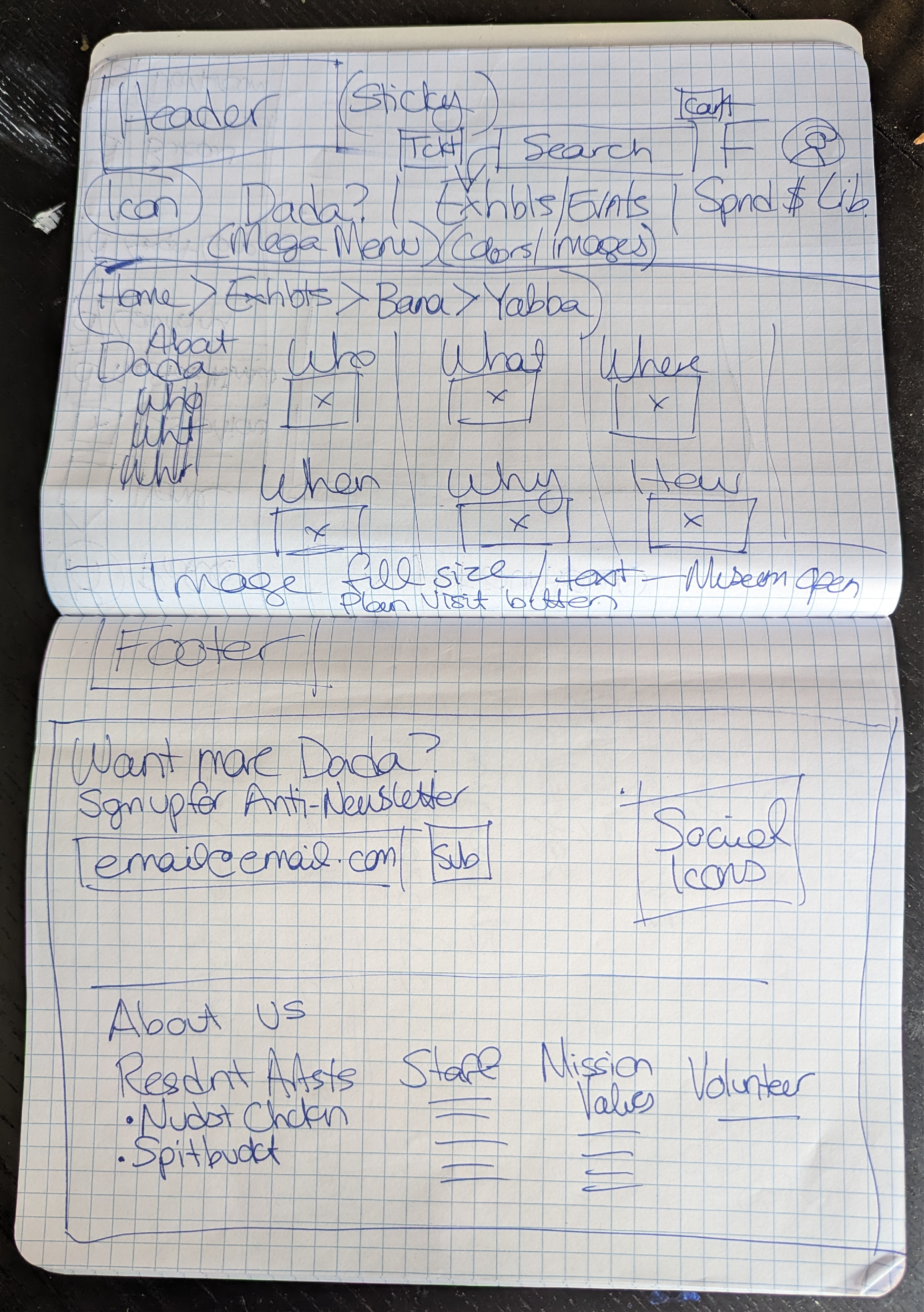
Paper Wireframes
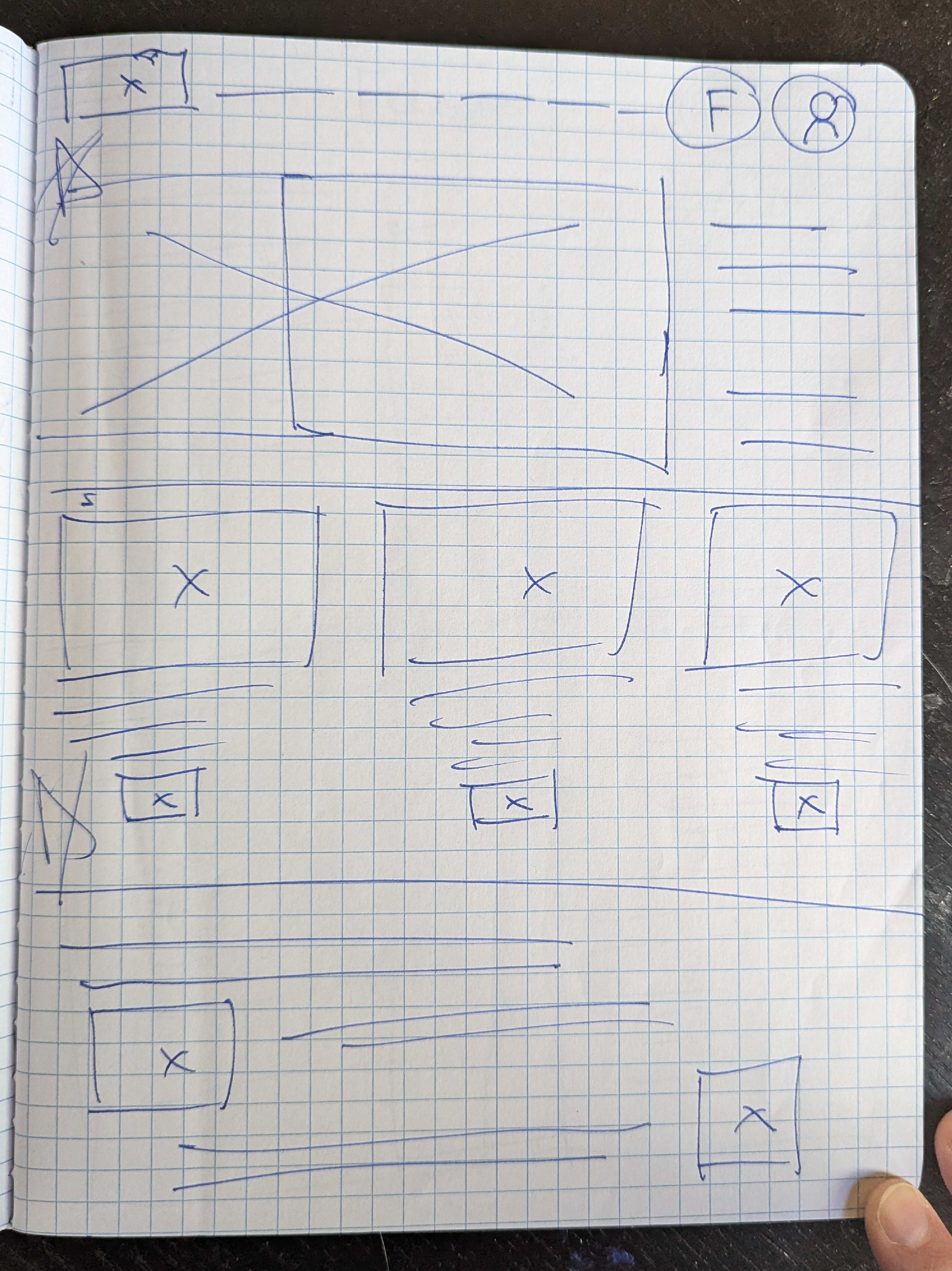
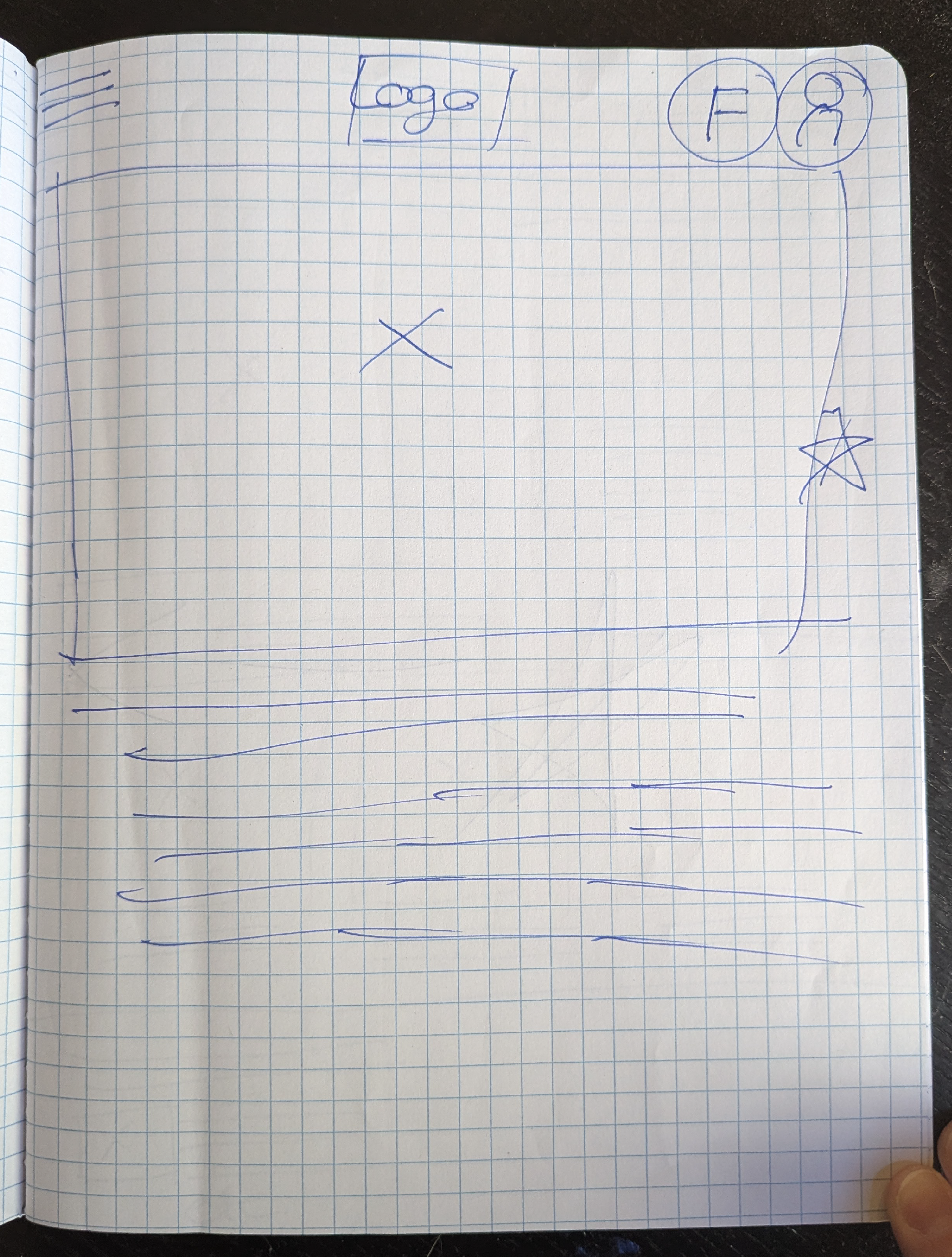
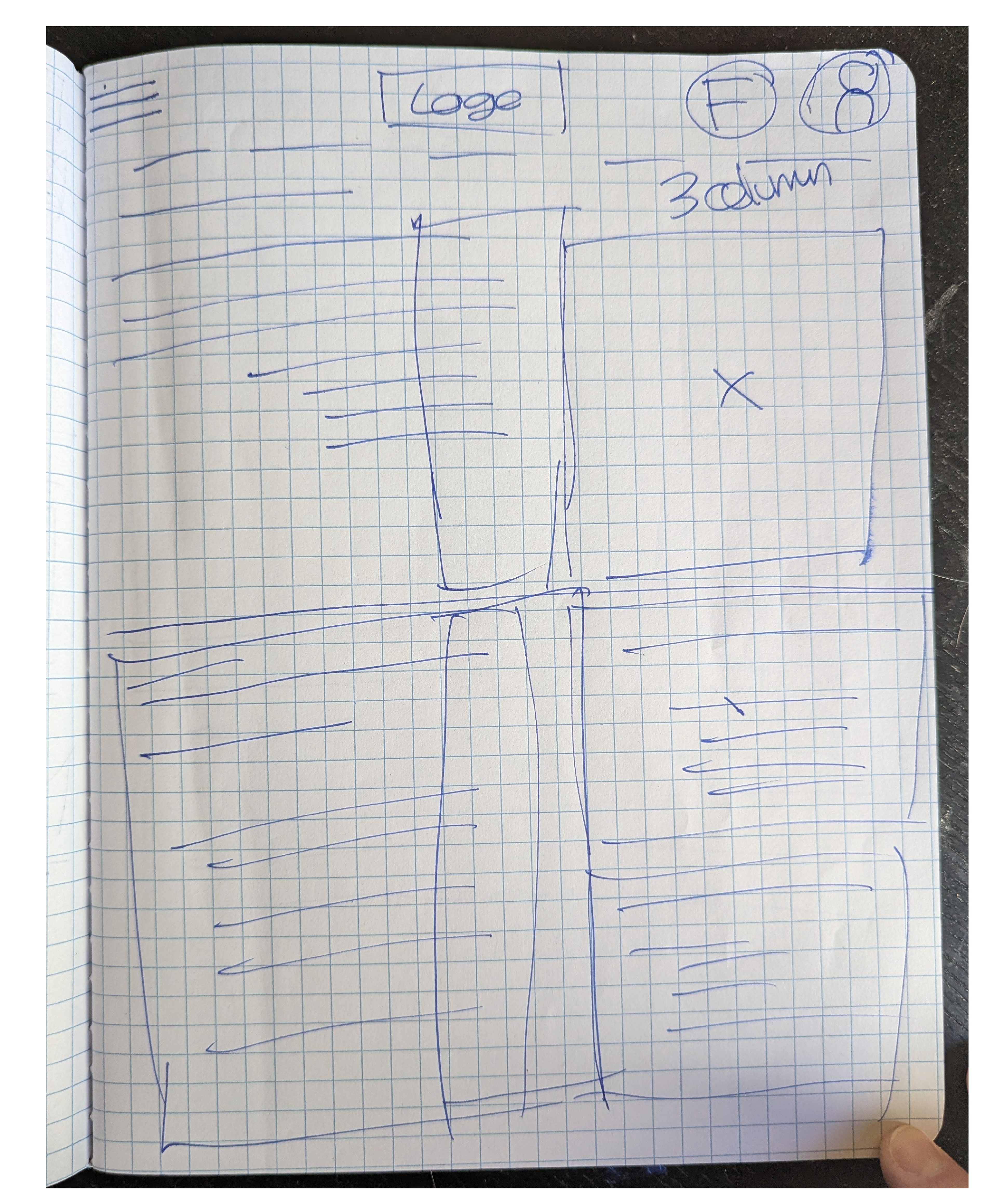
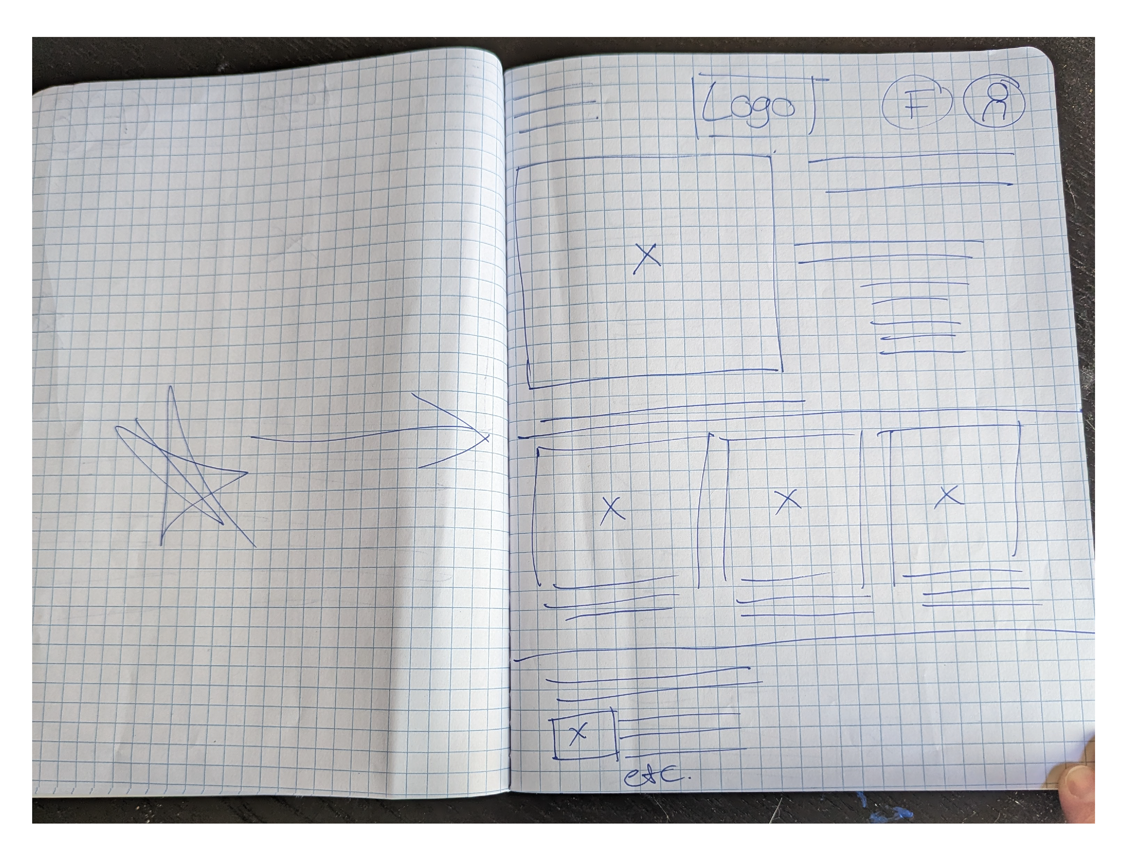
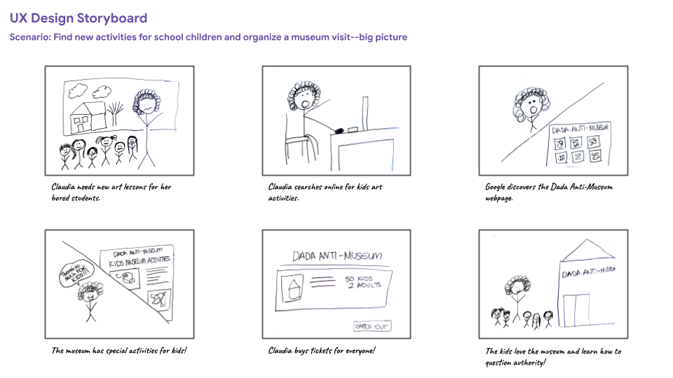
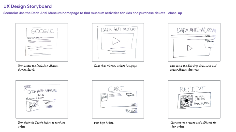
Storyboards
Digital Wireframes/Lo-Fi Prototype
CHALLENGE: So far through my course, I have conflated the wireframes and lo-fi prototype. I made a serious effort not to do that, and make a clean set of wireframes without any of the aesthetic elements.
PROBLEM: I had made a clean set of wireframes, but I took those wireframes and created the lo-fi prototype: I didn't create a new file for the lo-fi prototype. I have learned my lesson.
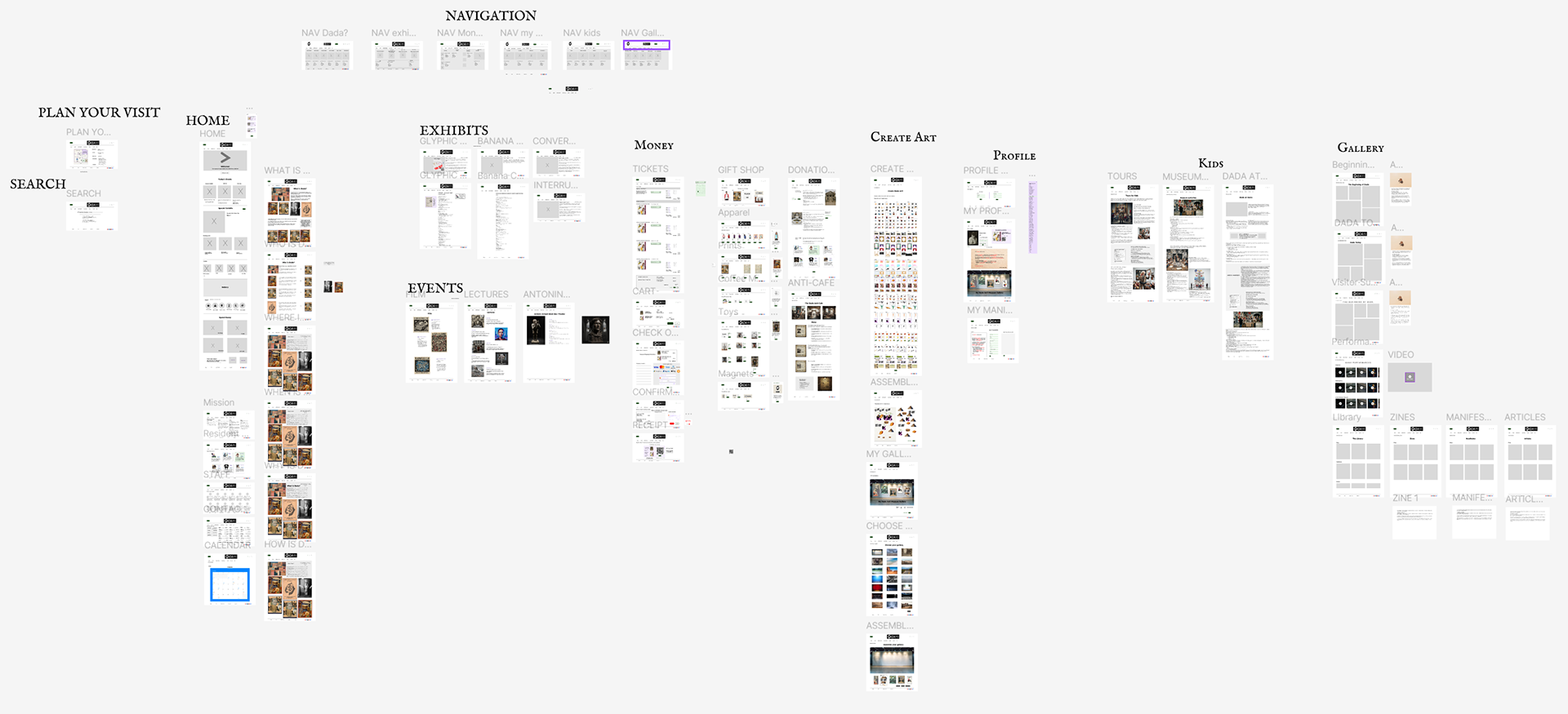
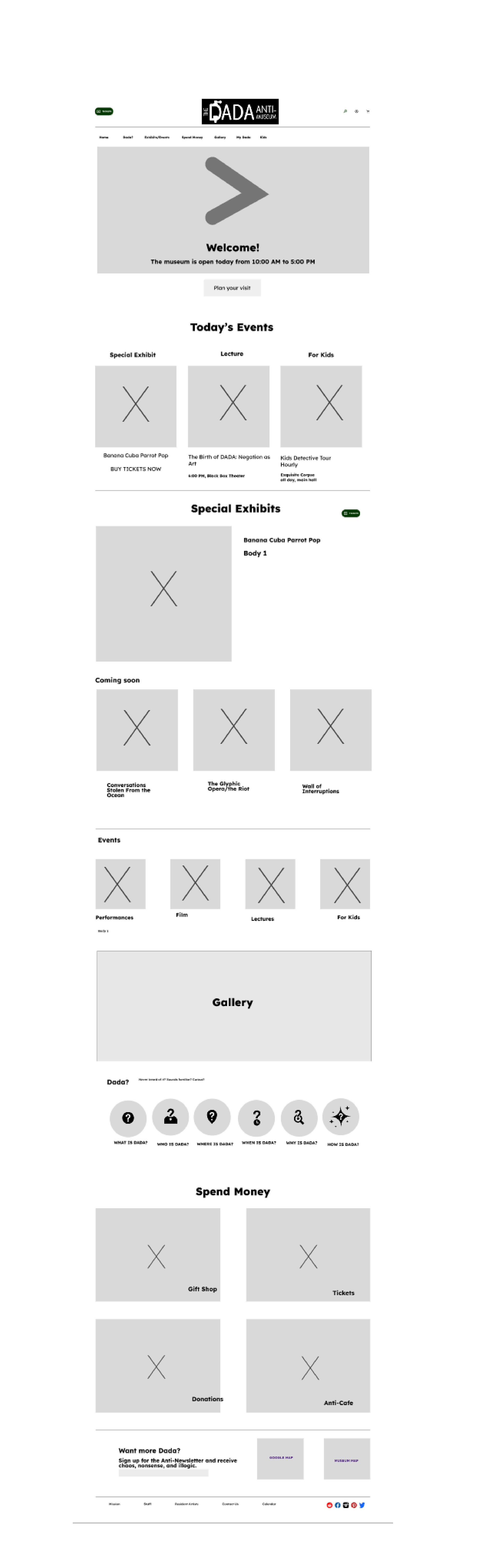
Home page
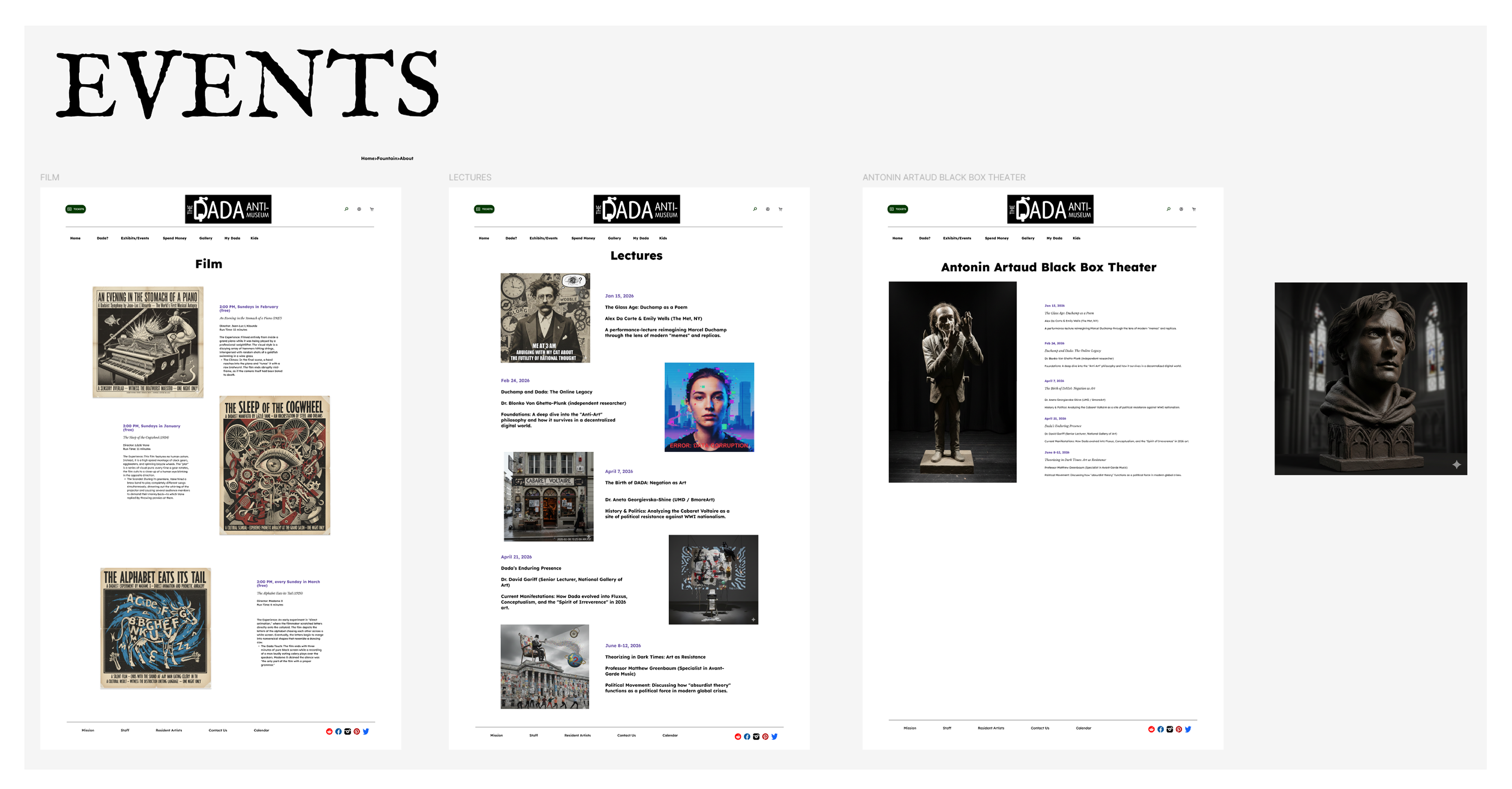
My initial concept was to break Events into three different pages.
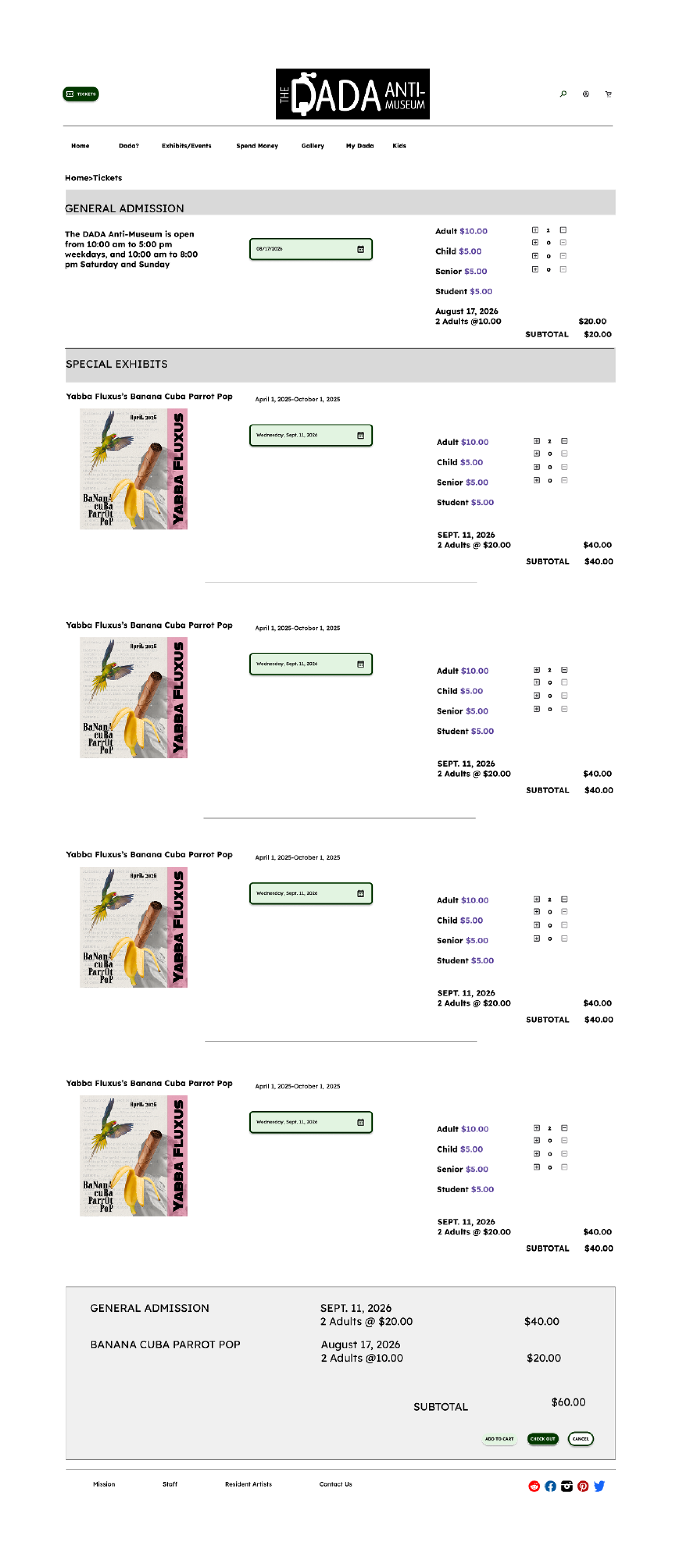
Ticket purchasing
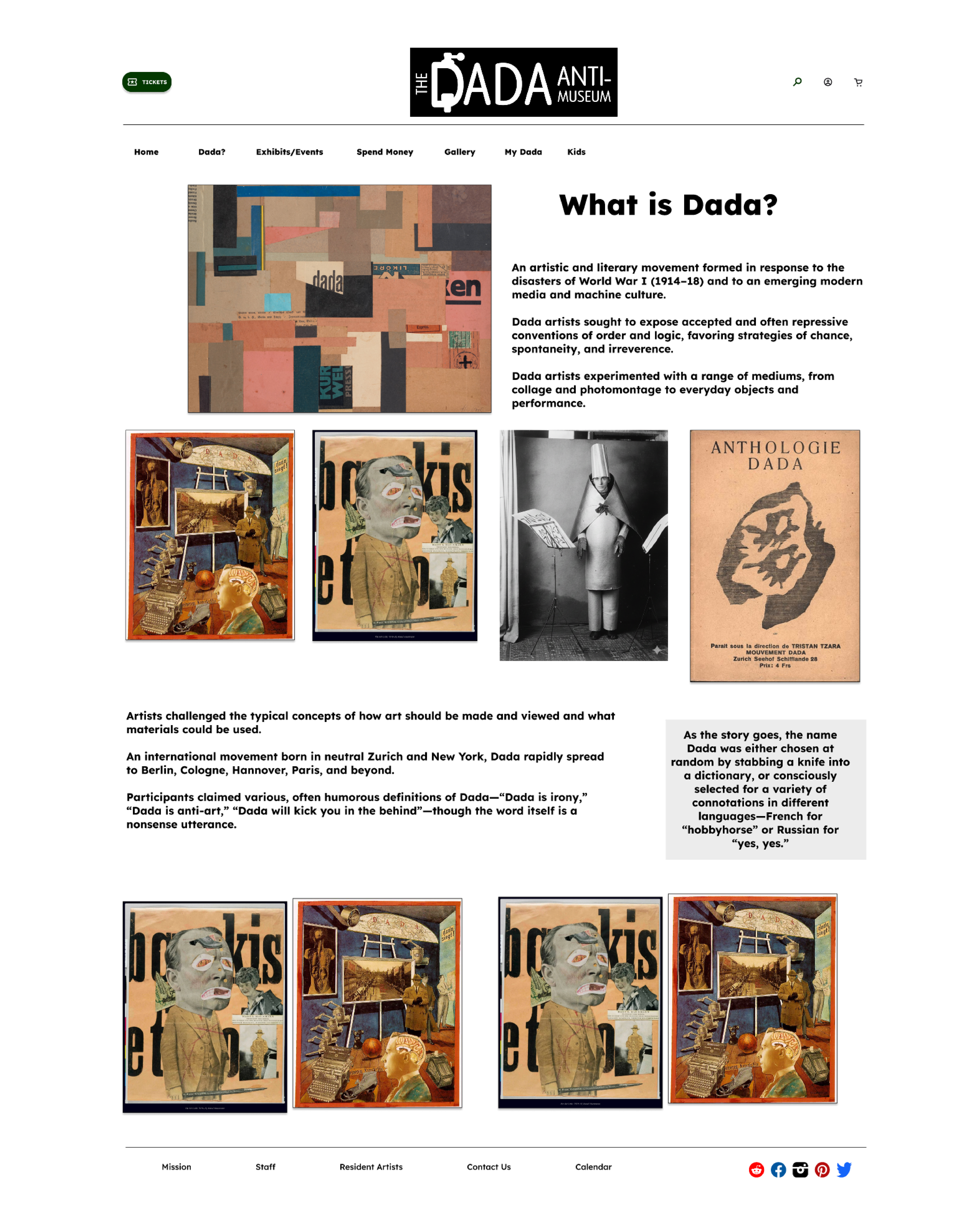
What is Dada?
What Was Cut
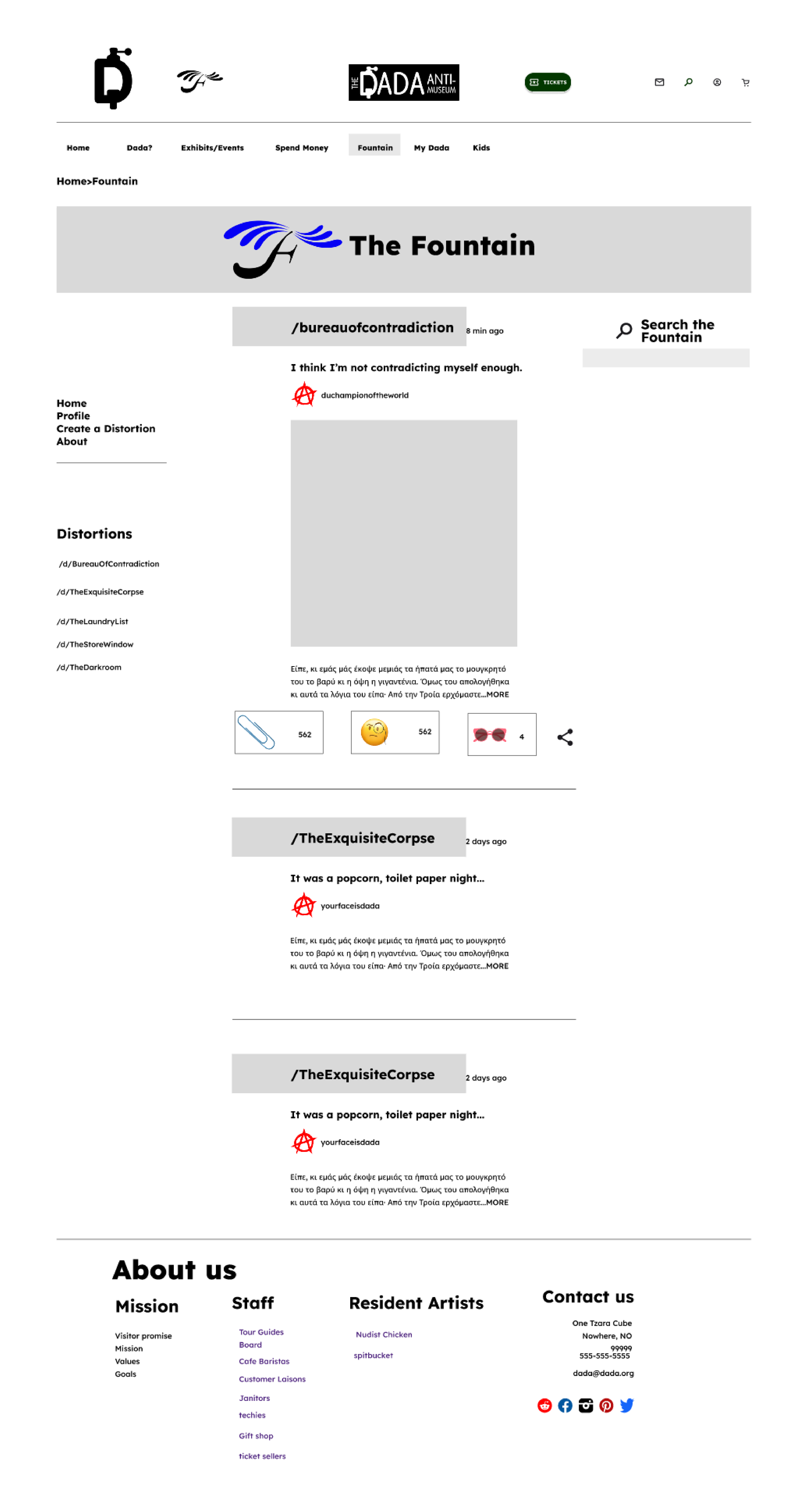
This is a reddit-like communication platform focusing on Dada and Dada artists.
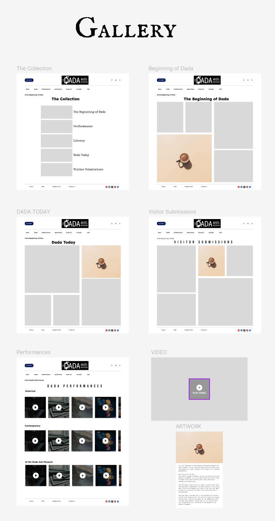
An extensive gallery of Dada art.
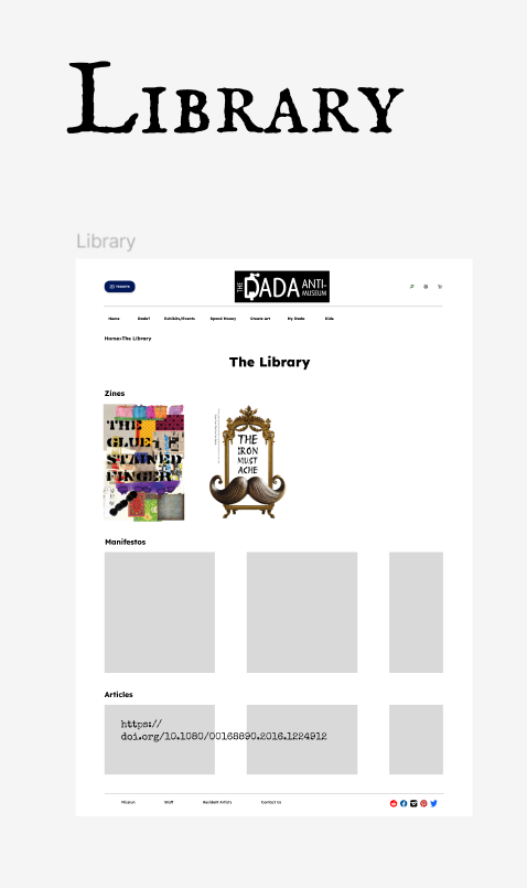
A collection of Dada manifestos, zines, and articles.
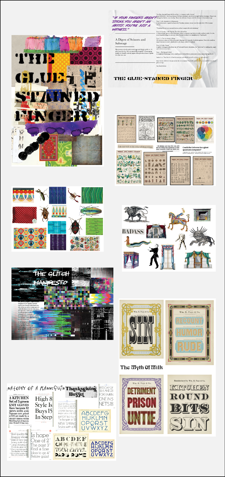
A fictional Dada zine.
I cut these elements before user testing out of concern that I was scope creeping myself again. These would have been enormous projects requiring a considerable amount of time and effort. I felt that these elements would be good for future development of the website and weren't required at this time.
Final Hi-Fi Prototype
The homepage video.
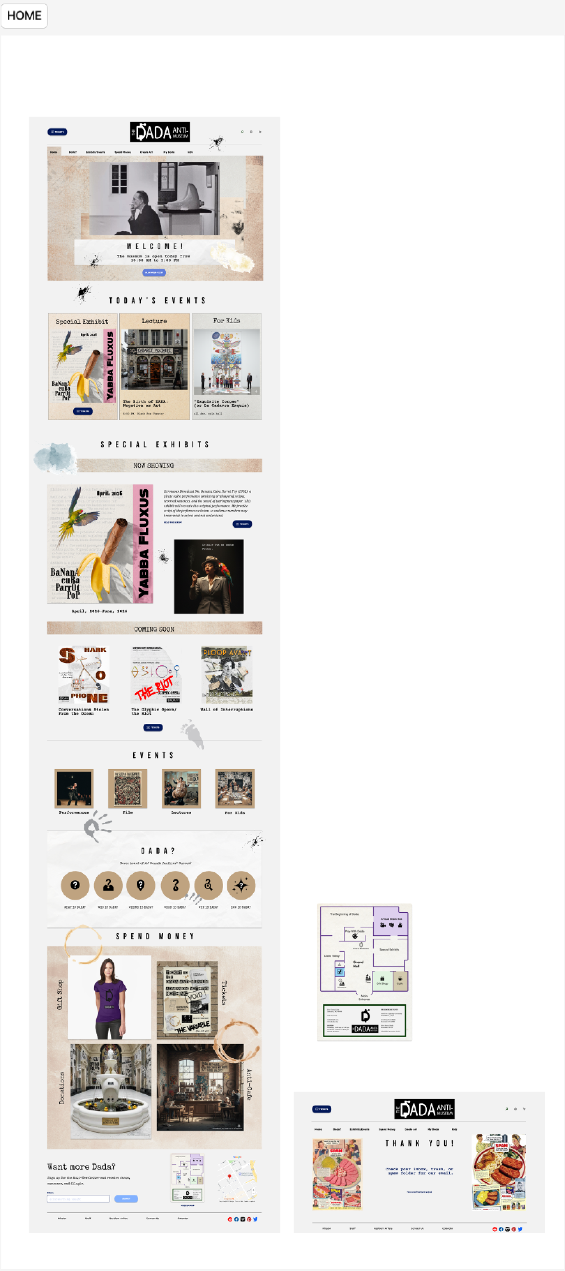
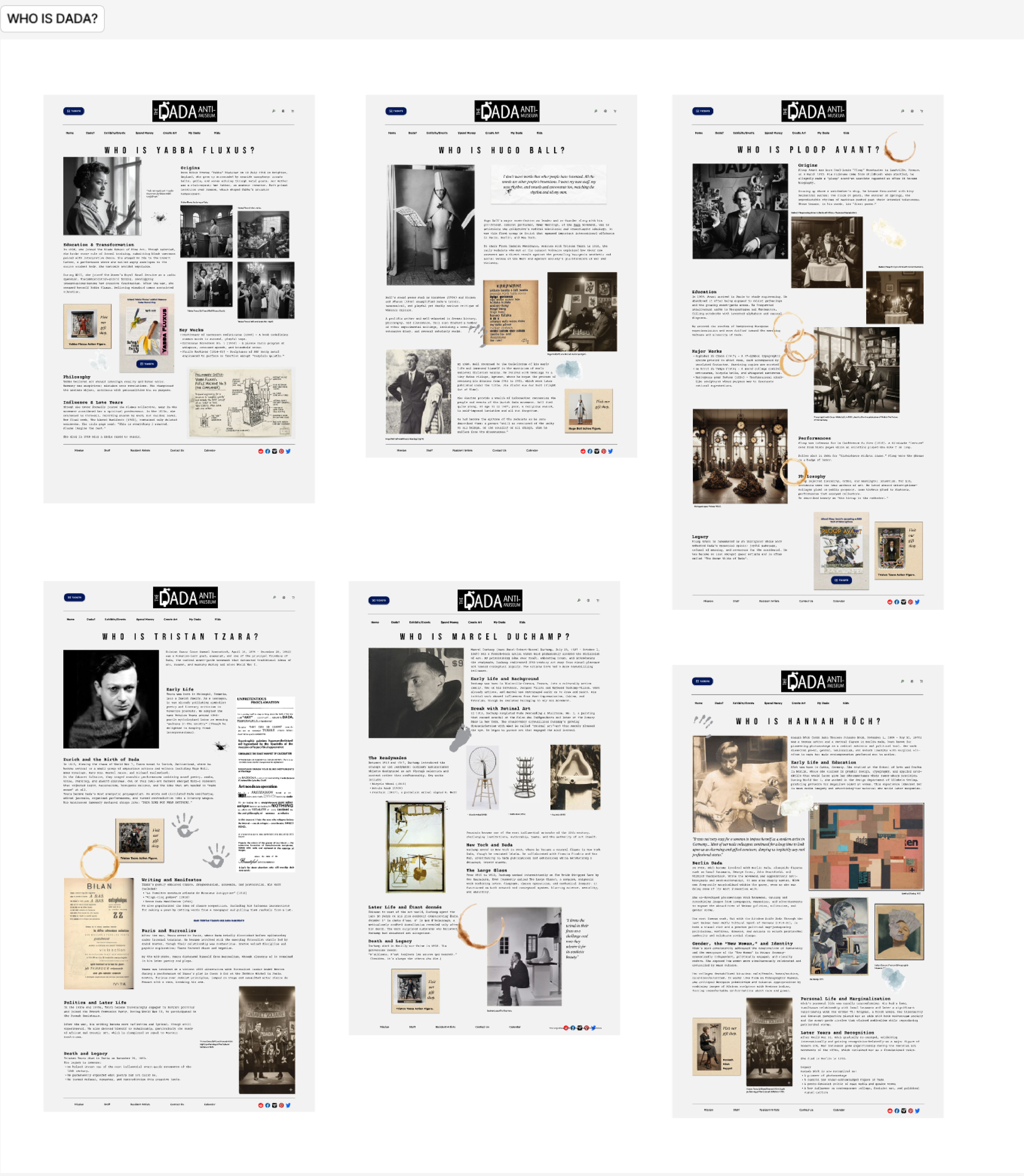
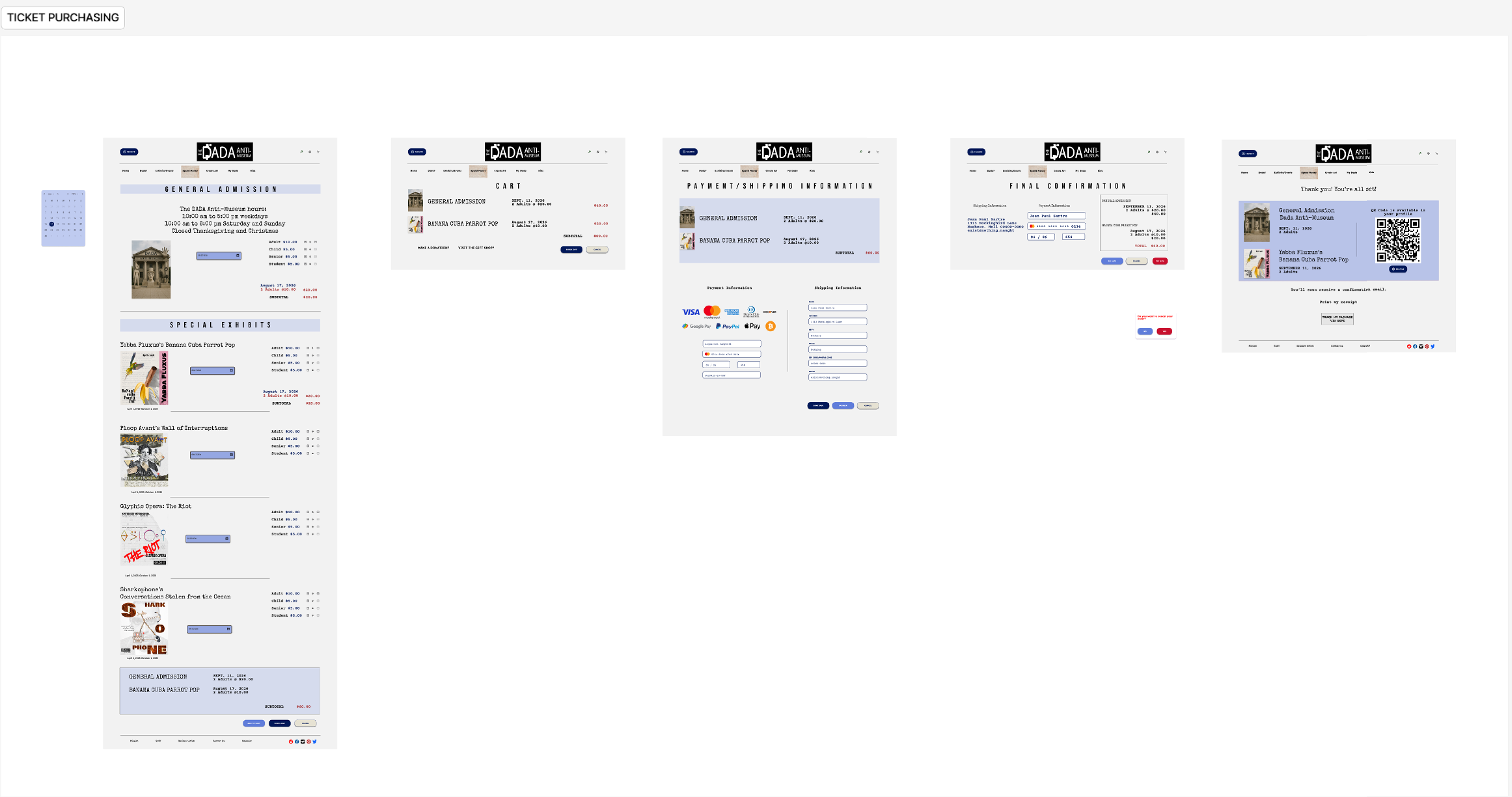
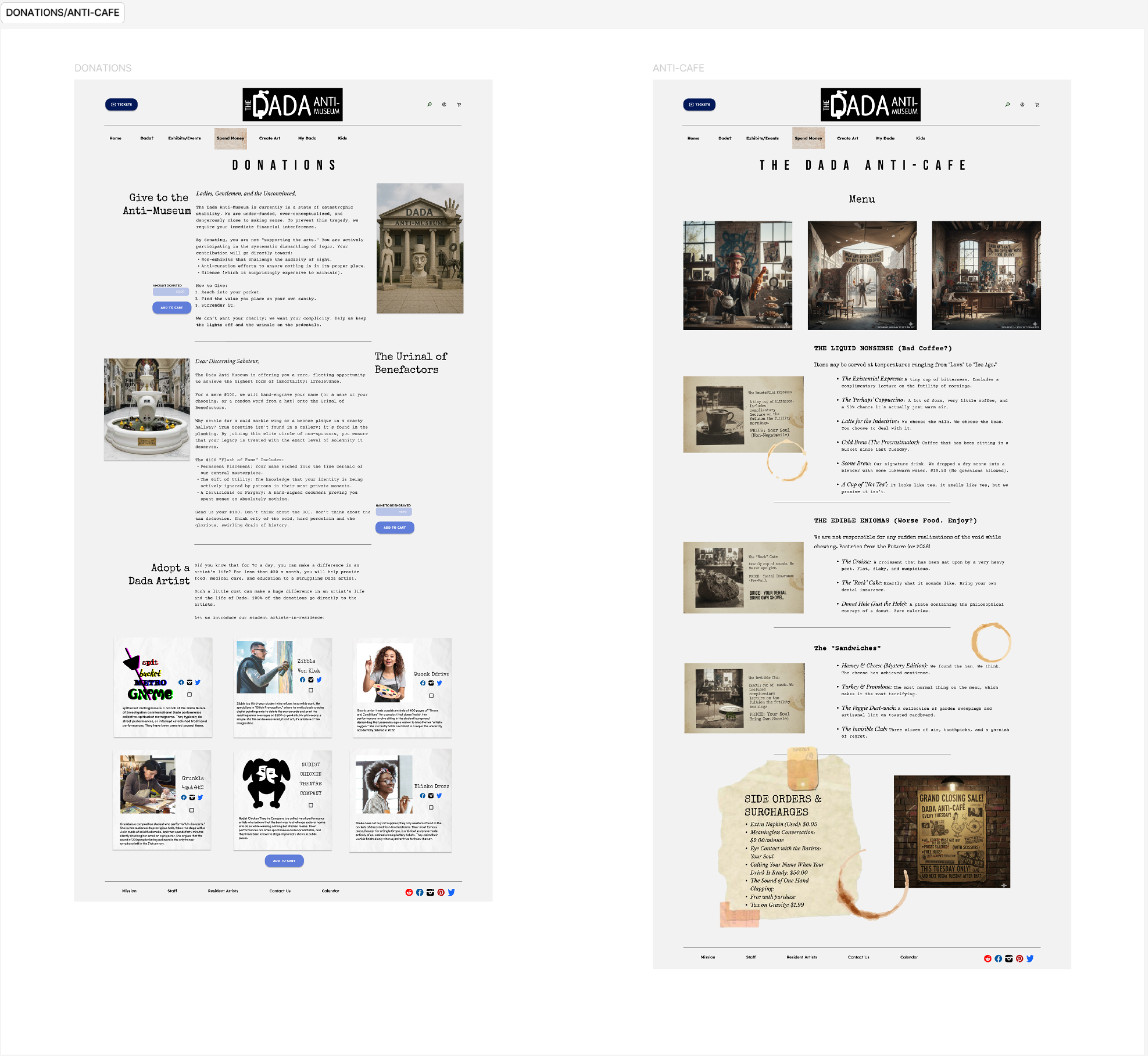
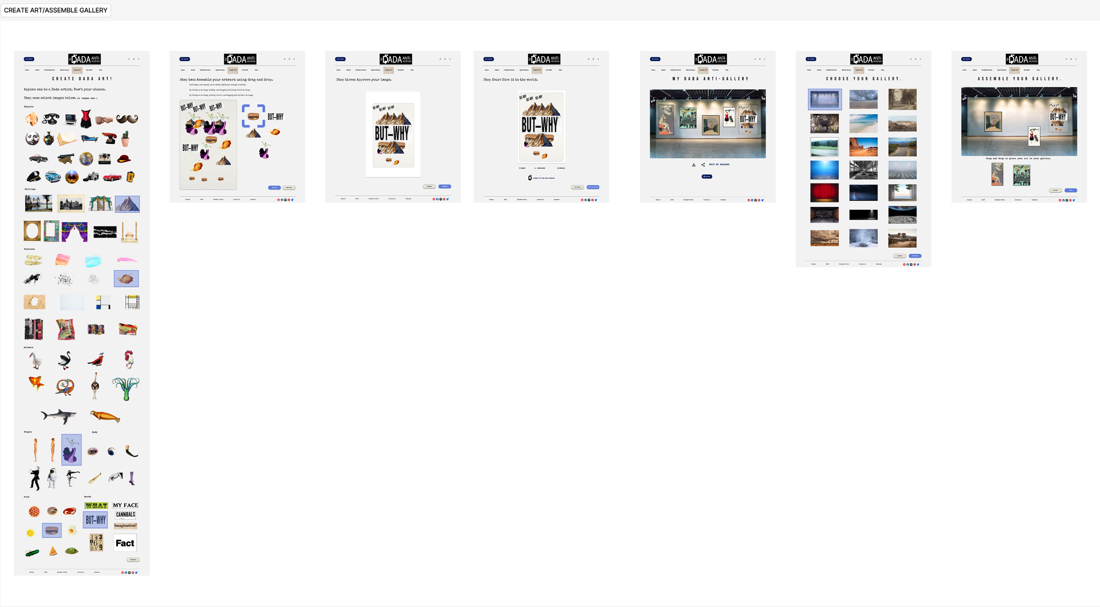
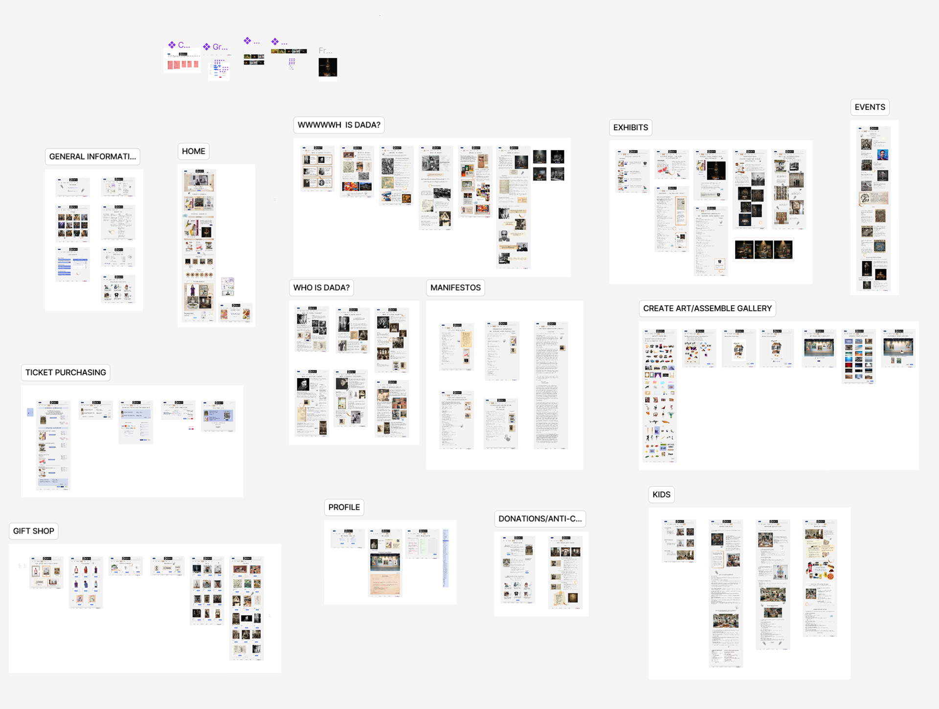
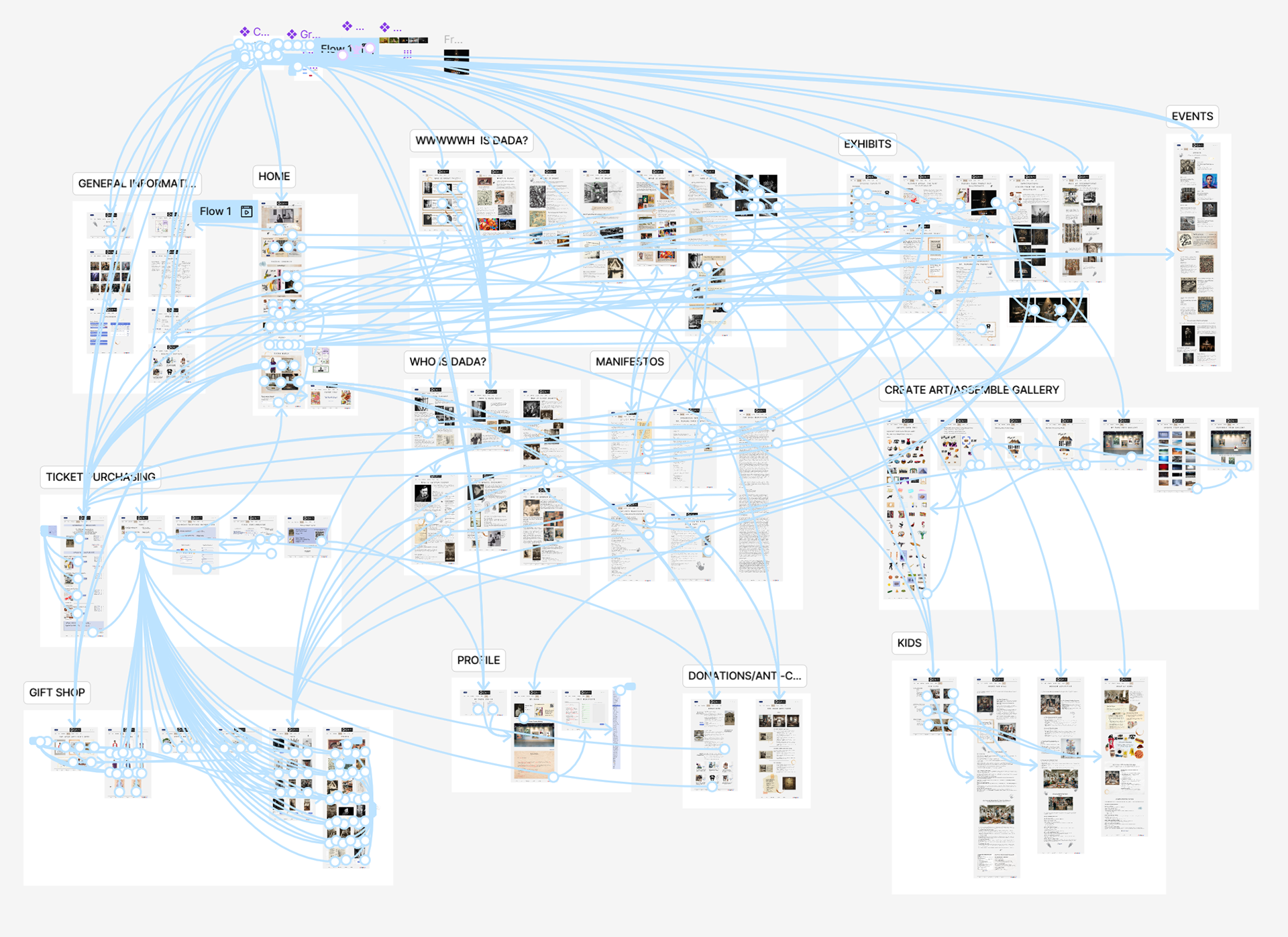
Browse the Prototype
Accessibility Considerations
1. I created uniformity in the design, establishing common text patterns, colors, icons, and arrangements. I adhered to app format conventions.
2. I primarily used the font family Lexend. Lexend is the most readable font for anyone with reading challenges, especially neurodivergent people.
3. I used different patterns to associate each section of the app. This would make groupings easier to see for the colorblind. The color palette is also high contrast.
Responsive Designs
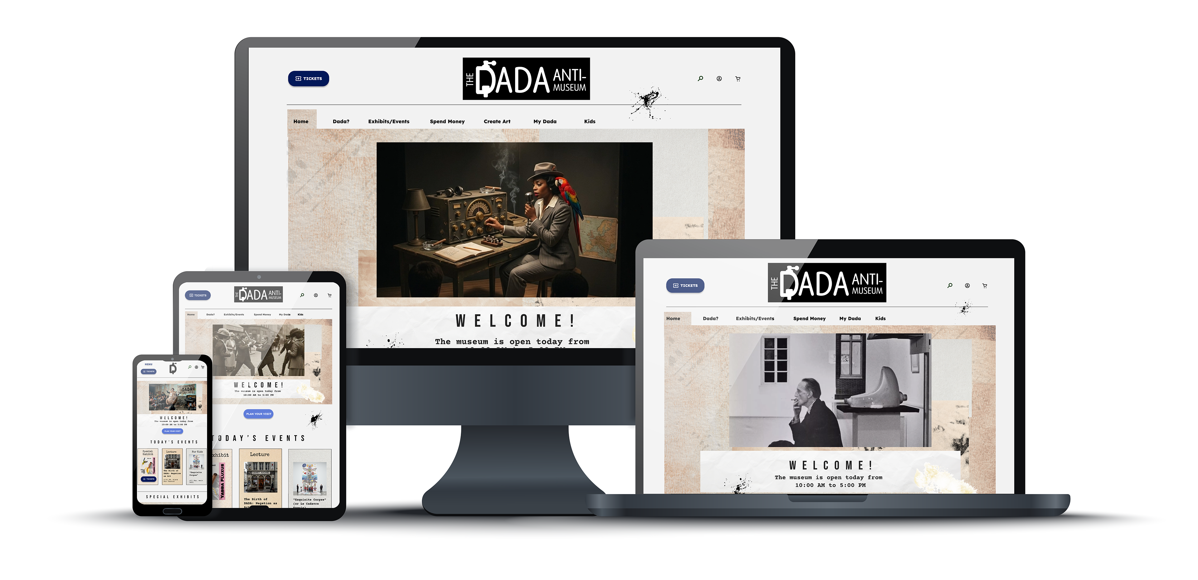
What's Next
I want to re-integrate the Library, Gallery, and Fountain. Fountain will be the hardest to build because of its complexity, but I think it will fulfill the vision and values of the website: to spread Dada throughout the world. The Library and Gallery are straightforward builds, but both have archives of information that would need to be sorted and curated.
What I Learned
1. I worked not to scope creep myself and keep the website to a manageable minimum. I did, but it was still a massive project. Again, I needed help building it.
2. I learned so much about Figma and how to be more efficient, but I still ran into problems with not making copies of my designs.
3. Scaling the website downwards, using graceful degradation, was much easier and helped me understand the design. Once I designed the mobile version, I wanted to return to my original app design and completely start over.
4. I have the following biases: Creator's Bias, Habituation Effect, Selective Abstraction, False Consensus Effect, Self-Reference Criterion, and Selective Omission.
5. I feel uncomfortable with white space, and feel it is a bad design choice. This isn't a bias, but more of a side-effect of my neurodiversity.